
In the previous article, I explored the history of pigments used in painting up to 1850, and considered changes in techniques. This article covers Impressionism and the period up to the early twentieth century, focussing again on oil painting in Europe and North America.
Pigments
The first truly ‘modern’ pigment, Prussian blue, had changed the oil painter’s palette in the early eighteenth century, and was followed by other synthetic pigments including emerald green and synthetic ultramarine blue in the early nineteenth century. Chemistry developed as a science, and was strongly linked with the industrial manufacture and exploitation of new synthetic substances. The nineteenth century saw the successful introduction of more new pigments than had the preceding two millenia.
Yellow ochre and chrome yellow (introduced about 1804) were the major yellows in use in the middle of the nineteenth century, but were soon joined by cobalt, cadmium, and zinc yellows during the 1850s. The newcomers were relatively expensive, and none became popular until the last quarter of the century. Cobalt yellow is not as intense in hue or saturation, is still costly, and has never become popular. Sporadic use of cadmium yellow, in Delacroix’s late palette for example, did not become more widespread until its cost fell towards 1900, and for many painters chrome yellow remained the pigment of choice.
From 1910 on, the first of the Hansa and arylide yellows became available; subsequently some have not proved as lightfast as cadmium yellows, but remain an alternative. Cadmium orange was adopted over a similar period as its sister yellows and reds.
Vermilion (cinnabar, mercuric sulphide) remained in use until cadmium reds became more affordable. Madder lakes were progressively replaced by alizarin crimson over the period 1826-1868. Alizarin is the synthetic form of the most important pigment in madder lake, and although it is now known to have relatively poor lightfastness, it was a great improvement on madder derivatives.
Synthetic ultramarine blue and Prussian blue continued to be used widely. Cobalt blue (and violets) started to appear as pigments around 1800, but were initially prohibitively expensive, and did not see more widespread use until the middle of the nineteenth century, mainly as an alternative to ultramarine, which in any case had become much cheaper now it was synthetic. Cerulean blue (cobalt stannate) came into use in the latter half of the nineteenth century, but has never been used as extensively except for the painting of skies.
Emerald green and mixed greens based on Prussian blue were joined by chrome green from about 1840. Over the next couple of decades, chromium oxide, the basis of chrome green, developed into a range of green pigments including those known as chromium oxide, chrome, and viridian greens.
Lead white remained very popular in oil painting, but zinc white (which had previously been used as Chinese white in watercolour) started to come into use in 1845. It lacked the covering power of lead white, and later was discovered to become more transparent with age. Vincent van Gogh was an enthusiastic user, but in conjunction with lead white and not as a substitute for it. It was not until 1925 that titanium (dioxide) white started to appear in oil paints, and much later in the twentieth century before lead white became less widely used.
Carbon, ivory and related blacks continued in general use. Asphalt, bitumen and mummy fell from favour, probably as a result of the change to direct painting methods, and the catastrophic deterioration which was observed in many older paintings which had used them.
Complex organic pigments such as anthraquinone and quinacridone reds, indanthrone blue, and phthalocyanine blues and greens, were the products of the increasingly sophisticated industrial chemistry during the twentieth century. They have progressively replaced alizarin crimson, Prussian blue, and supplemented greens in the modern palette, and lead white has been all but replaced by titanium white, largely as a result of the toxicity of lead.
Examples and palettes


Pissarro’s The Marne at Chennevières (1864-5), one of his few paintings to have survived the Franco-Prussian War, is pre-Impressionist in style and appearance. Its colours generally have saturations under 40%, even those in its unusually rich range of blues, which may have included both cobalt and synthetic ultramarine blues.


One of the early distinctively Impressionist paintings, Monet’s Bathers at la Grenouillère (1869) shows a palette with much broader range, including greens, some of which exceed 60% saturation. The blues in the sky are also more saturated, rising towards 60%.
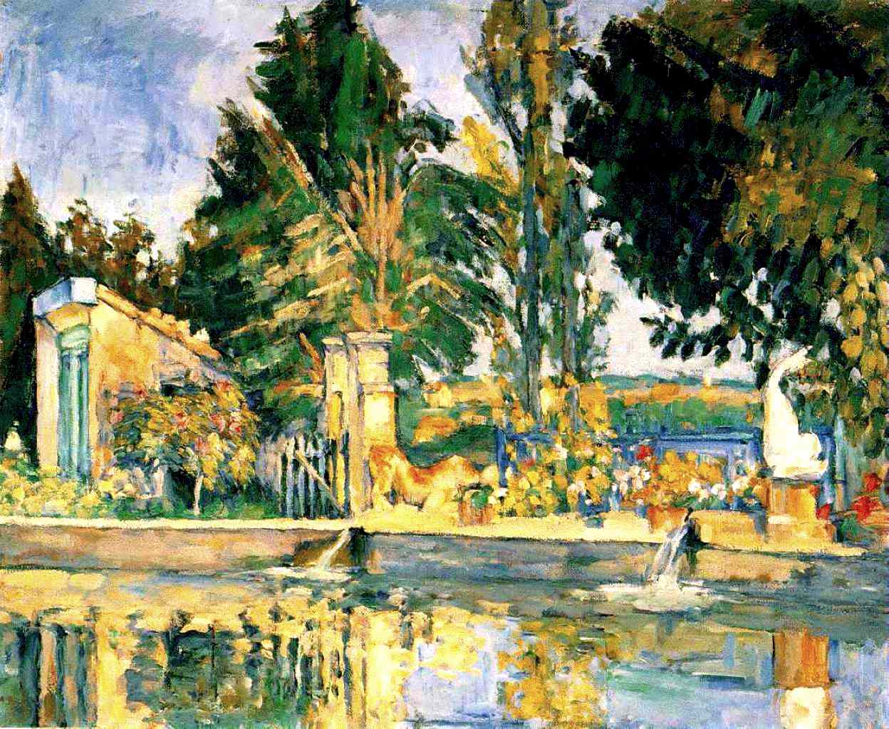

Painted during his Impressionist period, Cézanne’s The Pool at Jas de Bouffan (1876) appears light and bright, but only its browns and yellows reach saturations of more than 50%. Many of Cézanne’s later landscape paintings and those in his Bathers series have more saturated greens and blues.


Claude Monet began using cadmium yellows when he achieved commercial success in the 1880s, but other Impressionists and contemporaries were often unable to justify the cost. The yellows used in his Bordighera (1884) have been shown to be cadmium yellow, and result in a range of yellows and greens with saturations from 75% to 80%. The deeper blues are also between 50% and 60% saturated, with seven of the sixteen colours exceeding 50% saturation.
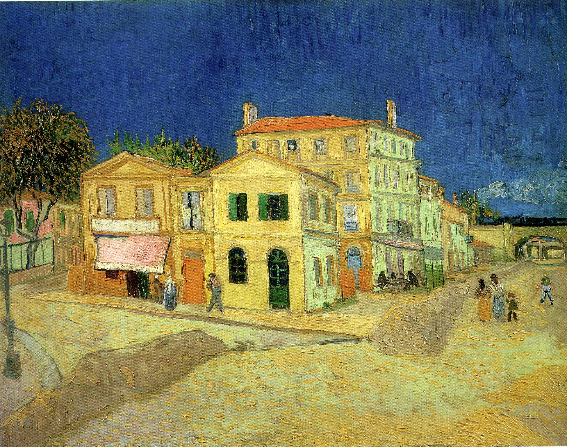

Vincent van Gogh’s Vincent’s House in Arles (The Yellow House) (1888) is a post-Impressionist painting which is visibly rich in saturated colours. Eleven of the sixteen colours extracted from this image have saturations above 50%, with yellows-to-browns and blues generally exceeding 70%.


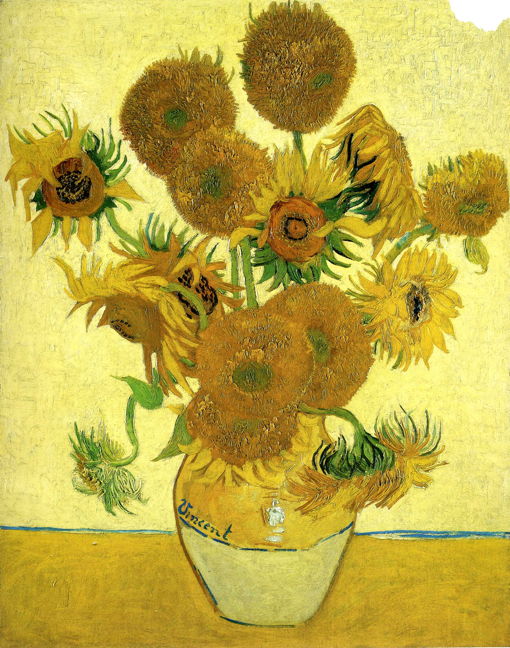
Although often claimed that Vincent van Gogh’s famous paintings of sunflowers used cadmium yellows, analysis reveals that in those works at least, the main yellow pigment used was in fact chrome yellow. Again, saturations are universally high: all the sixteen colours extracted exceed 50%, with those in the gold to brown range being between 80% and 86%.


These two palettes were obtained from paintings in Monet’s Grainstacks series, Wildenstein numbers 1273 and 1289, from 1890-1. They do not have the same intensely saturated colour as van Gogh’s paintings, but they do have a wider range of hues, and many saturations exceeding 40%.


Much later in Pissarro’s career, as in Setting Sun and Fog, Éragny (1891), his palette also used more saturated colours: here all the orange-brown colours have saturations over 40%, and three exceed 70%. Although an early user of cadmium yellow, he was also known to have used chrome yellow and orange.
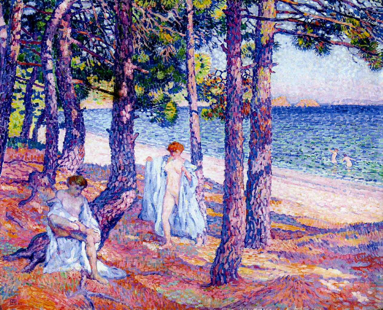

By the early twentieth century, artists such as Théo van Rysselberghe were using unprecedented palettes of intense colours. In his Bathers under the Pines at Cavalière (1905), every colour in the rainbow was used, many at more than 60% saturation. The extensive use of purple/violet colours, at saturations of up to 62%, can only be attributed to the use of newer pigments.


Paul Signac’s Notre-Dame-de-la-Garde (La Bonne-Mère), Marseilles (1905-6) also features a very broad range of colours, from its highly saturated ochre-yellows at one end, to a saturated magenta at the other.


Monet’s later paintings could be as colourful, as shown in his San Giorgio Maggiore at Dusk (1908), but only colours in the sunset spectrum, from orange through to red-brown, reach the high saturations found in van Gogh’s and van Rysselberghe’s earlier paintings.

Later paintings in Impressionist style used rich and saturated colours too. Childe Hassam’s Mrs Hassam’s Garden at East Hampton (1934) has saturated light browns and greens, and its intense red reaches 90% saturation.


Finally, Robert Delaunay’s Rythme no 1 (1938) is almost an exercise in the use of modern, highly saturated colours: its reds have saturations between 80% and 94%, green-gold and yellow 81%, and mid-blue 83%, showing off their new high-intensity pigments.
Example palettes include:
- Camille Pissarro: chrome yellow, cadmium yellow, chrome orange, vermilion, rose madder, cobalt violet, cobalt blue, French ultramarine blue, viridian green, raw sienna, flake white, ivory black;
- Claude Monet (c 1880): cadmium yellow, vermilion, alizarin crimson, cobalt blue, French ultramarine blue, Prussian blue, emerald green, viridian green, green earth, raw sienna, burnt sienna, light red, red earth, flake white, zinc white, ivory black;
- Paul Cézanne: chrome yellow, cadmium yellow, Naples yellow, yellow ochre, red ochre, vermilion, madder lake, alizarin crimson, cobalt blue, French ultramarine blue, Prussian blue, emerald green, viridian green, green earth, flake white, zinc white, peach black;
- Vincent van Gogh (1889-90): chrome yellow (in some paintings, cadmium yellow), yellow ochre, chrome orange, geranium lake, vermilion, red lead, carmine (cochineal), cobalt blue, French ultramarine blue, Prussian blue, emerald green, viridian green, raw sienna, red ochre, lead white, zinc white, bone black;
- Odilon Redon: lemon yellow, light red, vermilion, alizarin crimson, cerulean blue, French ultramarine blue, Prussian blue, emerald green, viridian green, raw umber, burnt umber, raw sienna, burnt sienna, flake white, zinc white, ivory black;
- Joan Miró: lemon yellow, cadmium yellow, vermilion, alizarin crimson, cobalt violet, Prussian blue, raw umber, burnt umber, raw sienna, burnt sienna, flake white, zinc white, ivory black.
Technique
The wide range of different techniques used over this period includes direct painting (alla prima), both plein air and in the studio, the Divisionist method of applying small dots or patches of colour, as well as experimental oddities such as peinture à l’essence, in which the painter removed as much oil medium from the paint as possible, and replaced it with the diluent turpentine.
Traditional methods based on layers and glazes were gone, except among revisionists like Bouguereau who continued to exhibit in the Salon. Paint was often applied quite thickly, the brush and knife marks of its facture being left proud. Media and soft brushes intended to produce the smooth gloss finish which had been so typical of the Salon were abandoned.
Colours were often selected and mixed in order to obtain an overall colour ‘harmony’ rather than necessarily being a faithful rendition of what most viewers would have observed in the motif. Earlier emphasis on establishing an accurate tonal range was often abandoned, with objects being depicted largely using form and colour alone. Some artists added to those patterned brushstrokes, such as Cézanne’s ‘constructive stroke’.
With the widespread availability of industrially-made oil paint in tubes, many artists mixed their colours on their palette and applied them in a manner which exploited contrasts with other patches of colour, rather than gradually building layers and tonal rendering on the canvas.
In the next article of this series, I will attempt to provide more objective analysis of the changes which took place in pigments and palettes between 1400 and 1900.
References
Artists’ Pigments. A Handbook of Their History and Characteristics, four volumes, various editors and many contributors, National Gallery of Art and Archetype Publications. 1986-2007.
Vellekoop M et al. (eds.) (2013) Van Gogh’s Studio Practice, Yale UP / Van Gogh Museum.
