
It was probably Leonardo da Vinci who first proposed that red and green complemented one another, although later Roger de Piles castigated such combinations as ugly. That dogma delayed the widespread use of complementary colours for aesthetic reward until the middle of the 18th century.
Currently a complementary pair is defined as being two colours that, when mixed in proper proportion, produce a neutral in the range from white to black.
In painting, the traditional complementary pairs have been based on subtractive colours: red/green, blue/orange, and yellow/violet. The working rule has been that the complement of a primary colour is the secondary generated by mixing the other two primaries, and colour wheels have usually positioned these secondaries opposite their complementary primaries.
We owe this to Goethe’s failed attempt to supplant Newton’s original rainbow model of colour, but confusion and conflict between subtractive and additive colour systems reigned until the late 19th century, when Helmholtz teased them apart.
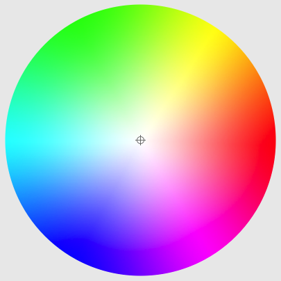
Open the Mac OS X Colour Picker in any application and look at its colour wheel, which is quite different from that of painters. Being principally for the additive colours of illuminants – rather than that for the subtractive colours of colourants – red and green are not diametrically opposite.
Instead, the complement of pure red (RGB 255, 0, 0) is cyan (0, 255, 255), a turquoise blue; opposite green (0, 255, 0) is magenta (255, 0, 255), a violet hue; opposite blue (0, 0, 255) is yellow (255, 255, 0). The sectors of this colour wheel are dominated by the additive primaries of red, green, and blue, with notable but thin spokes of cyan, magenta, and yellow – the subtractive primaries long standard in printing and photography.
Viewed on the more conceptually tricky CIE 1931 x-y colour space, complementary colours appear opposite one another on the inner triangle used to define a standard colourspace such as sRGB.

For example, pure primary blue is at the corner of the colourspace at the lowest part of the graph, with y close to zero, and its complement is at the opposite side, on a line passing through the central white point, mid-way along the line joining the point of highest x (primary red) and that of highest y (primary green) – that is yellow.
The traditional artists’ subtractive concept of complementary colour appears quite different, using two adjacent corners of the colourspace triangle, such as red and green. If that seems less than intuitive, switching to the more rigorous L*a*b* system rather than good old RGB should reduce even the most competent colourist to long bewildered silences.
These strained concepts are not clarified by pro colour software, which seems quite capricious in its choice of complements. X-Rite’s comprehensive ColorMunki Design, for example, pairs primary red with a shade bluer than pure cyan, primary green with a colour mid-way between magenta and pure red, and primary blue with orange.
It is at least simpler and crisper than the Ostwald colour system’s 12,960 ‘harmonic combinations’ of colour, opaque concepts built into the Munsell system, or the challenge of mixing true neutrals with real paints.
Thankfully it is easier to check all this colour theory by perceiving complementary colours for yourself: stare at a brightly-lit red area for 30 to 60 seconds, then look away at a white surface to ’see’ the correct complement to red, cyan. As Rolf G Kuehni has so succinctly put it:
“It is evident that the rules of colour harmony vary widely and lack a solid basis. Opinions have changed often.”
Updated from the original, which was first published in MacUser volume 26 issue 11, 2010.
