

Here is a short summary of the practical points which I have developed in the previous articles in this series.
Mapping Values (Lightness)

When viewing most motifs, lightness constancy comes into play, and the brightest areas will appear near white, whilst the darkest darks will appear near black. Compared under the same lighting conditions, a conventional ten-point value scale helps you match values accurately.
The exception to this is when painting a small area of what you can see: you should then try to establish the motif’s lightness scale within the lit area which you will paint.
Most paintings are small relative to their surroundings, and viewed in different light. The viewer’s perception of lightness will therefore not be set against the whitest white of the painting, but that of the surrounds. Map values in your painting to ambient lighting in the studio or environment in which you are painting.
When accepting a commission, check how your work will be lit when it has been completed and delivered, and consider simulating those lighting conditions during painting.
Perceiving Colour
Our best colour vision and ability to resolve detail is in the centre of the visual field of each eye, and colour vision and detail vision fall off towards the peripheries of the fields.
Interpretation of colour varies between individuals, even when they have ‘normal’ colour vision.

Most of us find six ‘pure’ colours which we would not ordinarily consider to be mixtures of two or more colours: white and black, red and green, yellow and blue, and those pairs are usually perceived as being opposites.
The further conditions depart from those of common natural lighting, the more colour constancy breaks down. Colour constancy is seen most reliably in objects whose colour is well known and relatively invariant.
Interaction of Colour
Colour perception is altered by adjacent colours and changing light, as ‘colour constancy’ is lost in extremes. As with lightness, these effects come into play when studying the colour composition of a motif. As with ‘lightness constancy’, a painting is is too small to create a constancy of its own, in the way that a full motif does.
A painting is therefore more prone to the interaction of colours which are brought together in closer proximity than in nature.
It is important during painting to adjust the hues used to ensure that effects shown on the canvas adequately reflect what you see in the motif, and your own interpretation of it. This is less about precise colour matching than creating the right effect.
Progressive changes in hue are a common feature of aerial perspective, in which more distant objects tend towards the blue end of the visual spectrum; these are referred to as ‘cooler’ hues, i.e. towards the blue, rather than ‘warm’ or red end of the spectrum.
Trying to achieve ‘colour harmony’ is part of your own personal colour style. Rather than trying to copy colour choices made by others, develop your own colour choices and combinations which determine the look of your paintings. One person’s colour harmony may be another person’s contrast or even clash.
Although lightness and chroma can be approached successfully using methodical approaches, hue is much more hit or miss. Developing a good ‘eye’ for colours is generally much more important than arbitrary theory.
Palettes
As a general principle you should ensure that the hues offered in your paints cover the full spectrum which you wish to depict.
A palette normally needs to include colours close to the unique hues of red, yellow, and blue at the very least. It is wise to add white (unless working in transparent watercolour alone) and black, and the fourth hue of green is often helpful, particularly when painting landscapes with vegetation.
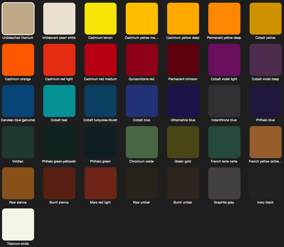
The order in which you place colours on your palette should be consistent, so that you know exactly where each colour is. Logically it might follow the standard colour wheel, progressing from red, orange, yellow, green, blue, to violet. You may wish to place earth colours after that main colour sequence, followed by greys and black.
Paint manufacturers give colours in the order lemon, yellow, orange, red, violet, blue, green, earths, greys, black, and that is a sound and popular order for the palette too. This is a matter of personal preference. It is important to eliminate colour interactions, so placing similar hues adjacent to one another is the best strategy.
The palette itself, and other surfaces on which you mix colours, should be achromatic to eliminate any risk of simultaneous contrast and other interaction effects. Although there are good arguments for choosing a palette which is grey rather than white, most prefer white or light grey, particularly when painting on white or light grounds.
Colour Shift
All paints change colour to some degree. The best pigments and paints show imperceptibly small colour shifts during the drying process. These are usually not noticeable in good oil paints, may be large enough to be noticed in watercolours and gouache, and are often largest in acrylics. Allow for or correct colour shifts occurring soon in the drying process.
Choose a medium which does not change colour significantly during drying; the tendency of many oil paints to yellow with age is a constant concern.
Lightfastness
A few pigments are not chemically stable. Some react with pollutants to form compounds of different colour. Others change colour or fade by reduction in chroma as a result of prolonged exposure to light.
Never consider using a paint from any manufacturer, however reputable, unless they identify which pigments are in the paint, and how lightfast the paint is. For some paints there are ASTM standards against which they should be tested, or the manufacturer should give details of an equivalent method and the results.
Never use a paint whose pigments are unspecified, or whose permanence is untested. Check individual batches, as pigment formulations change, and may alter the lightfastness rating. You are wise to perform your own lightfastness tests.
Reducing Chroma (and Lightness)

Chroma is the simplest of the colour variables to adjust, although invariably in combination with lightness.
When using transparent paints such as watercolours on white grounds, chroma is altered by adding diluent to weaken the concentration of pigment. For paints which dry by polymerisation, such as acrylics, transparent medium should be added instead of diluent, so that the pigment is dispersed in a strong paint film.
When using opaque paints such as oils, gouache and opaque acrylics, chroma is altered by adding white paint to weaken the concentration of the coloured pigment. When opaque, this will result in a paint film which is also opaque, and not weakened in any way, but relies on the permanence of the white pigment used.
Chroma can also be reduced in oil paints by adding diluent, in which case the paint film becomes more transparent, and its appearance will be altered by underlying colour; if that is a white ground, then it will not result in any shift in hue. Care must be taken to maintain sufficient medium to give a strong paint layer.
Interactions between coloured lower layers and upper layers of thinned pigment are the basis for coloured glazes, which are best achieved using a balance of diluent and medium, the latter providing mechanical strength to the glaze layer.
In each of these example of chroma adjustment, there is a simultaneous change in lightness, and chroma can only be reduced. Choose paints of high chroma value, as no mixture or layering can increase the chroma (unless with a similar hue and higher chroma).
Mixing Colours
The only way in which you can determine the exact lightness, hue and chroma of any given paint mixture is to try it out. Sets of colour mixing charts are very valuable, if not essential to understand how to use the paints in your palette.
Mixtures tend to reduce lightness and chroma, turning a muddy grey. The more pigments in the mixture, and the weaker their individual chroma levels, the fewer pigments are required in combination for this to become noticeable. It is best to start with paints containing only one or at most two pigments of high chroma, to enable the widest range of results from mixtures before chroma collapses.
Several standard green paints in most product ranges start off with more than two pigments, and will quickly turn muddy when mixed with other paints. Unless you choose single pigment blues and yellows, your own mixed greens may be no better.
Conclusion

I hope that you find these useful. Above all look, study, and ensure that those who view your paintings see how you enjoy using colour. For painting is about form, light, and colour.
