

After hue comes chroma…
Terms
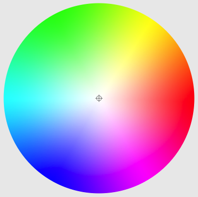
Chroma is the degree of departure of the area of colour from an area of grey of identical lightness. It thus equates to what is often called ‘saturation’, ‘intensity’, or ‘colourfulness’, and is in effect the amount of hue present in the colour. In most cases this is not easy to separate from lightness, as very pale colours necessarily have relatively low chroma. You can gauge the chroma by comparing the original colour with a matching patch which has been desaturated to grey.
Chroma was first made important in the Munsell colour system, although it had been recognised long before that.
Basic perception
Chroma has proved quite difficult to investigate experimentally, as there is considerable variation in perception between individuals, different tests, and on different occasions. However it is generally accepted that we are less able to discriminate between different levels of chroma than between small changes in hue, or lightness/brightness. There is a consensus that chroma is sensed about half as precisely as hue or brightness.
Importance
Chroma is important, but in our perceptions appears secondary to both hue and lightness/brightness. It is therefore an adjunct to edge discrimination and feature construction in images. It is more important in the perception of surface properties, in conjunction with lightness, for example to assess surface reflectance, and fine-patterned changes (with lightness) enable us to perceive surface textures.
Illusions and interactions
Chroma has been little-studied in illusions, except in combination with lightness or hue. Furthermore its interaction with lightness or luminance/luminosity makes separate study very difficult. Chroma constancy is part of the more general colour constancy, but has not been studied on its own as much as lightness or colour constancy have.


For example, these two test strips feature areas which are set at identical lightness/brightness, but whose luminance/luminosity differs. The first strip uses lightness/brightness fixed at 50%, the second at 75%. However the different coloured areas appear to have different levels of chroma, with the red and blue squares apparently higher in chroma than the others. This matches the differences in luminance/luminosity. This is thoroughly confusing, and illustrates how difficult it is to isolate chroma effects.
Painting solutions
Chroma is thankfully the simplest of the colour variables to adjust, although it is invariably altered in combination with lightness.

When using transparent paints such as watercolours on white grounds, chroma is altered by adding diluent to weaken the concentration of pigment. The danger with this is that paints which ‘dry’ by polymerisation, such as acrylics, would form a weaker paint layer and possibly fail to polymerise properly if diluted too much. In those cases, transparent media should be added instead of diluent, so that the pigment is dispersed in a strong paint film.
When using opaque paints such as oils, gouache and opaque acrylics, chroma is altered by adding white paint to weaken the concentration of the coloured pigment. When they are opaque, this will result in a paint film which is also opaque, and not weakened in any way. However it is also dependent on the permanence of the white pigment used: zinc oxide in particular has a tendency to become less opaque with age, and as a result passages with lowered chroma which use zinc oxide can tend towards transparency over time.
Chroma can also be reduced in oil paints by adding diluent, in which case the paint film becomes more transparent, and its appearance will be altered by the underlying colour; if that is a white ground, then it will not result in any shift in hue. Care still has to be taken to maintain sufficient medium to give a strong paint layer, though.
Interactions between coloured lower layers and upper layers of thinned pigment are the basis for coloured glazes, which are best achieved using a balance of diluent and medium, with the latter providing mechanical strength to the glaze layer.
In each of these example of chroma adjustment, there is a simultaneous change in lightness, and chroma can only be reduced. This is the reason for choosing paints of high chroma value, as no mixture or layering can increase the chroma (unless with a similar hue and higher chroma). Indeed one of the practical problems with mixing pigments is the tendency always towards lower chroma, resulting in muddy greys when too many pigments are combined.
As with hue, Fauvists and various Colourist schools have used heightened chroma to great effect.
Additional references
Handprint on colour. Bruce MacEvoy’s superb reference and tutorial information on colour may be overwhelming, and I am not convinced that his emphasis on optics is appropriate, but it is probably the most accurate available.
David Briggs’ Dimensions of Colour website includes many illusions, and discussion based mainly on a perceptive approach.
Kuehni RG (2005) Color. An Introduction to Practice and Principles, 2nd edn., Wiley Interscience. ISBN 0 471 66006 X. (A superb perception-based account by the leading authority on colour.)
