
I next focus on each of the ‘big three’ in turn, starting with lightness…
Terms
There are several different terms which you will find applied to this. Here I will try to keep to lightness, being the perceived brightness of a non-white area of colour compared with that of a perfectly white area. This is a form of brightness gauged relative to ‘perfect white’, and in painting is the approximate equivalent of tone or value.
You will also meet lightness in the Lab (or LAB, or L*a*b*) colour space used in computers and formal colour measurement. In those, the term lightness is not a true perception, but is modelled to approximate human perception. It ranges from 0 for the darkest perceived black to 100 to the brightest diffuse white, but also allows for values over 100 for the brightest specular reflection. This is useful because if you measure colour using a computer-based system like ColorMunki Design, or work with Adobe Photoshop or another app which supports L*a*b* colour space, you can measure and manipulate lightness values that are close to those perceived.
Brightness in turn is the absolute measure of light intensity as it is perceived. Strictly speaking, if the image we are considering does not contain a ‘perfect white’ against which we can set lightness, we should really refer to brightness instead.
Note that brightness is perceived, whilst terms such as luminance and luminosity refer to physical measurements which should correspond to brightness as perception.
Basic perception
I have already pointed out the huge range of physical light levels, luminance, over which we can see, ranging from the night sky to white illuminated cloud, and how this depends on changing aperture of the pupil, dark adaptation, and other mechanisms. However the range of brightness which we can cope with in a single image is considerably less, and sets the extremes of lightness, from darkest black to ‘perfect white’. This is still considerably greater than can be accommodated by most optical and electronic systems: you only have to take a panoramic shot including the sun and some very dark shadow to see how limited that is.
Viewed in comparative isolation, our perception of lightness is also very accurate, and by relating it to ‘perfect white’ there is inevitable lightness constancy. It is easy to check this, and to keep yourself in perfect calibration, using a value scale, which shows integral values of lightness. These are available ready printed from good art suppliers, or you can download a PDF from here and other locations to print your own.
To study the lightness levels in an image, simply desaturate it to greyscale, then adjust the brightness and contrast until the whitest white is shown as pure white, and the deepest dark approaches a pure black. This should match your perception of the full-colour image very closely.
Of course, the reference to fifty shades of grey in the title of this article is catchy and not intended to indicate how many different levels of lightness we can distinguish, which is far greater, probably in the hundreds or thousands. However because of the illusions I describe below, it is highly dependent on the conditions in which grey samples are viewed.
Importance
Lightness changes are very important in the perception of texture and surface properties, and the determination of edges and form. We interpret some changes in brightness as indicating shadows, which we use to construct 3D forms and depth. However when we interpret an area as being in shadow, we tend to adjust its perceived lightness so that the area in shadow remains continuous in lightness with other areas which are in the light. This is a complex process and prone to various illusions in spatial construction. When painting complex areas with shadows which could appear ambiguous, we may need to provide additional cues to ensure that the viewer can construct a stable perception of the passage (unless the ambiguity is itself part of the intention).
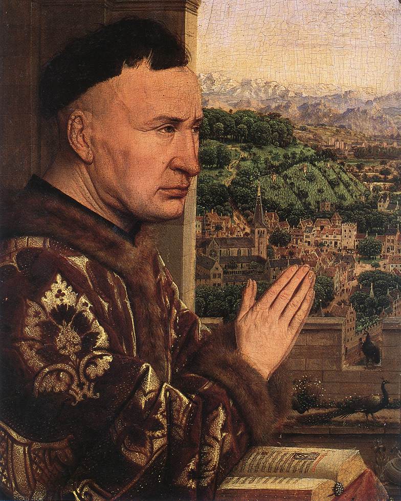
Irregular and patterned variations in lightness commonly result from surface texture and the optical characteristics of the surface (properties such as sheen). These enable us to distinguish soft fabrics from skin, polished metal from glass, and so on, as were first depicted vividly in the early oil paintings of Jan van Eyck and others in the Northern Renaissance.
Illusions and interactions
There have been several well-known illusions described in lightness perception.

In the Checker Shadow or grey square illusion, and its relatives, two areas of identical luminance/luminosity appear to have different lightness (or brightness). This is presumed to be the result of perceptive intent to maintain lightness constancy under shadow: we perceive that the darker grey squares are all the same level of lightness, so a ‘white’ square in shadow must therefore appear to be lighter than a grey square in full light. Further details are given in this Wikipedia article.

The Helmholtz-Kohlrausch illusion is observed when an area of colour is viewed against a background (or surround) of the same luminance/luminosity but without hue or chroma, i.e. grey. This illustrates the confounding effect of hue and chroma on lightness perception, and is discussed in detail in this Wikipedia article.

There are several illusions which show the effects on perception of simultaneous contrast. Concentrating on those most relevant to lightness, the lightness of an area is influenced by that of its background, surround, or adjacent areas. A simple example of this is to view the same colour (or luminance/luminosity, if grey) on a darker and lighter background; the darker background will make the colour/grey appear lighter still, whilst the lighter background will make it appear darker. This is discussed in this Wikipedia article.


Simultaneous contrast effects are also perceived when an area of the same colour or grey is viewed against changing or different background colours or greys, as shown.
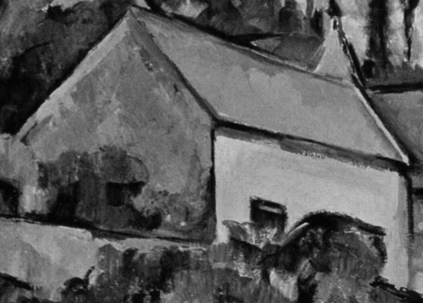
There is a whole family of illusions relating to edge effects, where lightness changes sharply. These interact with the other main perceptive clue to the presence of an edge, a change in hue. A simple example of this is seen in the detail of one of Cézanne’s late landscapes, in which he has left a dark (ultramarine) line at the edge in the centre, shown. The lighter area on the right of that edge appears to have an even lighter vertical line adjacent to the dark edge. Had he wanted to correct for this, he should have made the lighter area adjacent to the dark vertical line slightly darker, which would have resulted in perception of a more even lightness to the right of the line.
Painting solutions
When viewing most motifs, lightness constancy will come into play, and the brightest areas will appear near white, whilst the darkest darks will appear near black. Compared under the same lighting conditions, a conventional ten-point value scale will enable you to match values accurately. The exception to this is if you are painting but a small area of what you can see, perhaps in a still life, specially-lit studio work, or botanical painting, for instance. In those cases you must try to establish the motif’s lightness scale within the lit area which you will paint.
However most paintings are small relative to their surroundings, and viewed in ambient light (perhaps enhanced by local spotlights). The viewer’s perception of lightness will therefore not be set against the whitest white of the painting, but that of the surrounds. You therefore need to map values in your painting to ambient lighting in the studio or environment in which you are painting. If you do not, the viewer may perceive, for instance, that the value range is very narrow, and the painting lacks contrast.
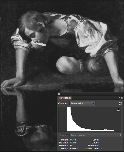
That mapping process between the brightness of the motif and the scale used in the painting also needs to take into account any lighting effects that you wish to incorporate. You can visualise these by opening an image of a painting in an image editor such as Adobe Photoshop, desaturating it to greyscale, then observing its luminance histogram. However sometimes ‘smart’ cameras and software may be a little too smart and adjust brightness and contrast behind your back! Another confounding factor is the ageing of pigments in paints, and the presence of superficial layers such as discoloured varnish.
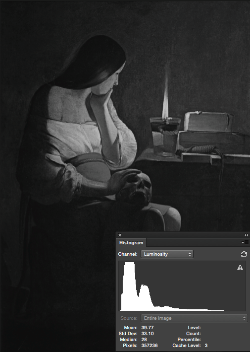
The sharp chiaroscuro employed by Caravaggio and Georges de la Tour, for example, makes most of the painting very dark, with a long, contrasting tail towards lights.
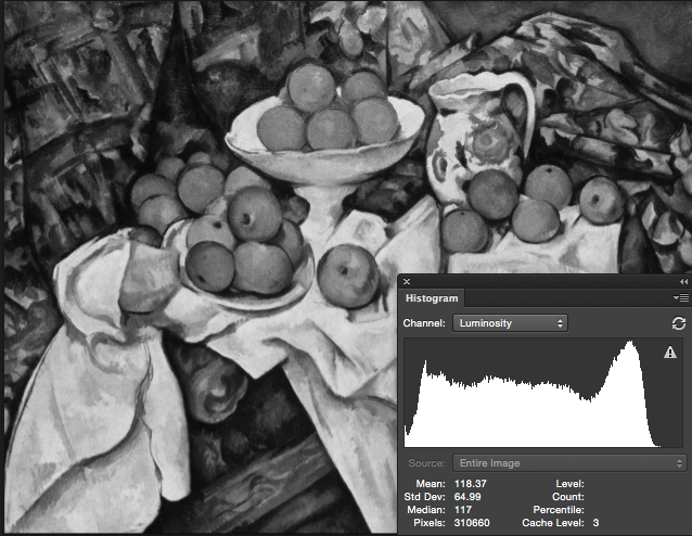
Much more commonly, paintings like Cézanne’s still life have a bell-shaped curve with most values in the mid-range, but some darks and lights providing a broad range of contrast. This is very similar to the curve for a photograph which most viewers consider to have attractive brightness and contrast.
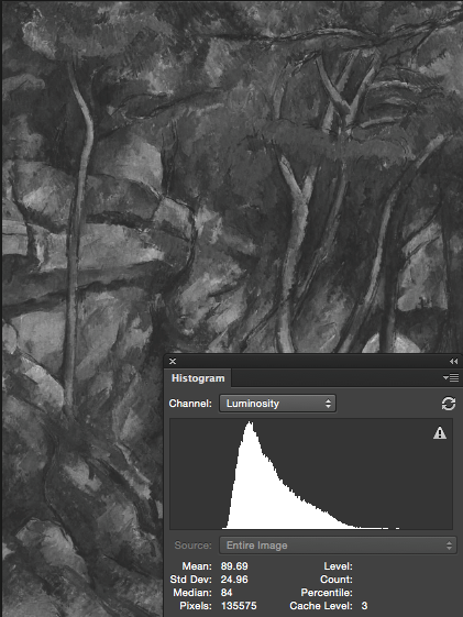
Cézanne’s experiments to try to move away from chiaroscuro and use colour ‘harmony’ instead of a range of brightness often results in compression of the curve so that his paintings have a narrow range of luminosity. When viewed under normal conditions, most observers will be unable to perceive lightness constancy confined to the painting, and it will appear of low contrast.
Additional References
Handprint on colour. Bruce MacEvoy’s superb reference and tutorial information on colour may be overwhelming, and I am not convinced that his emphasis on optics is appropriate, but it is probably the most accurate available.
David Briggs’ Dimensions of Colour website includes many illusions, and discussion based mainly on a perceptive approach.
Kuehni RG (2005) Color. An Introduction to Practice and Principles, 2nd edn., Wiley Interscience. ISBN 0 471 66006 X. (A superb perception-based account by the leading authority on colour.)
