

If you’re still struggling to find your way around the log, or not even prepared to try, I have a new version of my log statistics and navigation utility Logistician that should help. This enhances its list of log files by adding further details, and adds a completely new graphical view to help identify periods of unusual log activity.
Log list
As I showed here a couple of days ago, Logistician opens the JSONL statistics files maintained by logd in /var/db/diagnostics, alongside folders containing the tracev3 log files. The list of those originally gave a minimum of information, and that has been increased to contain:
- the start date and time of each file, in addition to the date and time it was closed
- the period during which that file had entries added to it, in seconds
- the size of log data within the file, in KB
- the average rate at which log data was written to that file, in B/s
- the path to that file, which reveals whether its type is Persist, Special or Signpost, hence the nature of its contents.
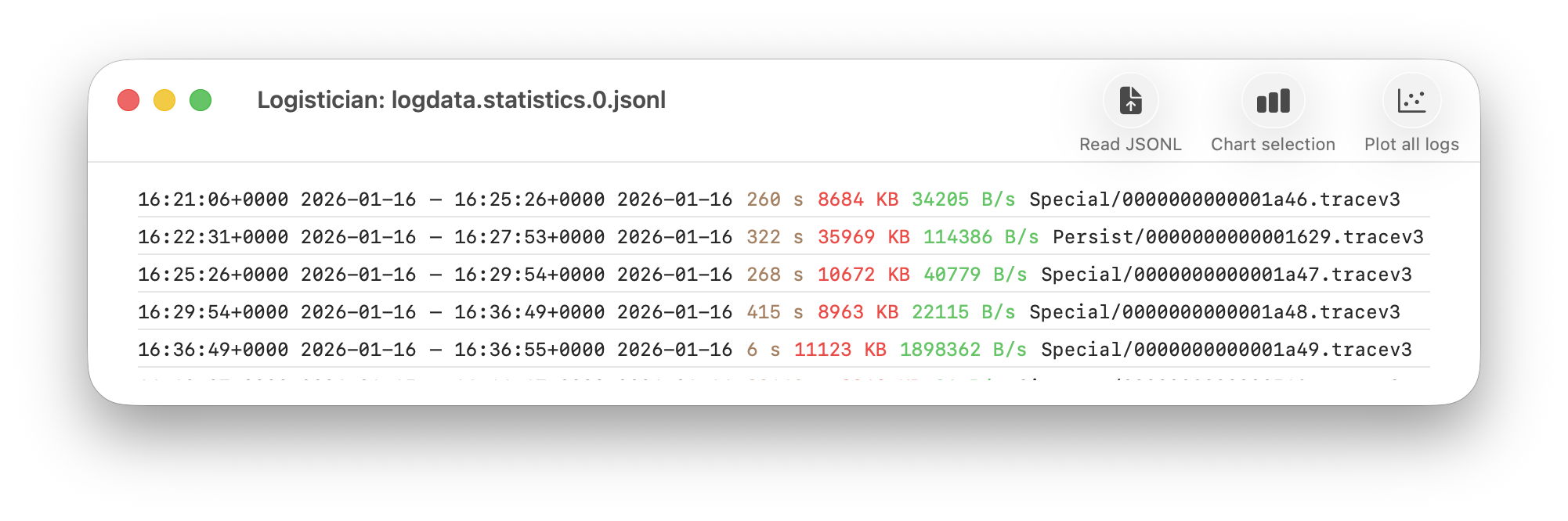
Start date and time are taken from those for the closing of its predecessor, so can’t be given for the first file of each type. They can also span a period during which the Mac was shut down, although that’s usually obvious from the low rate at which log data was written.
Point plot
The new window available plots point values for the whole series of log files in the current list.
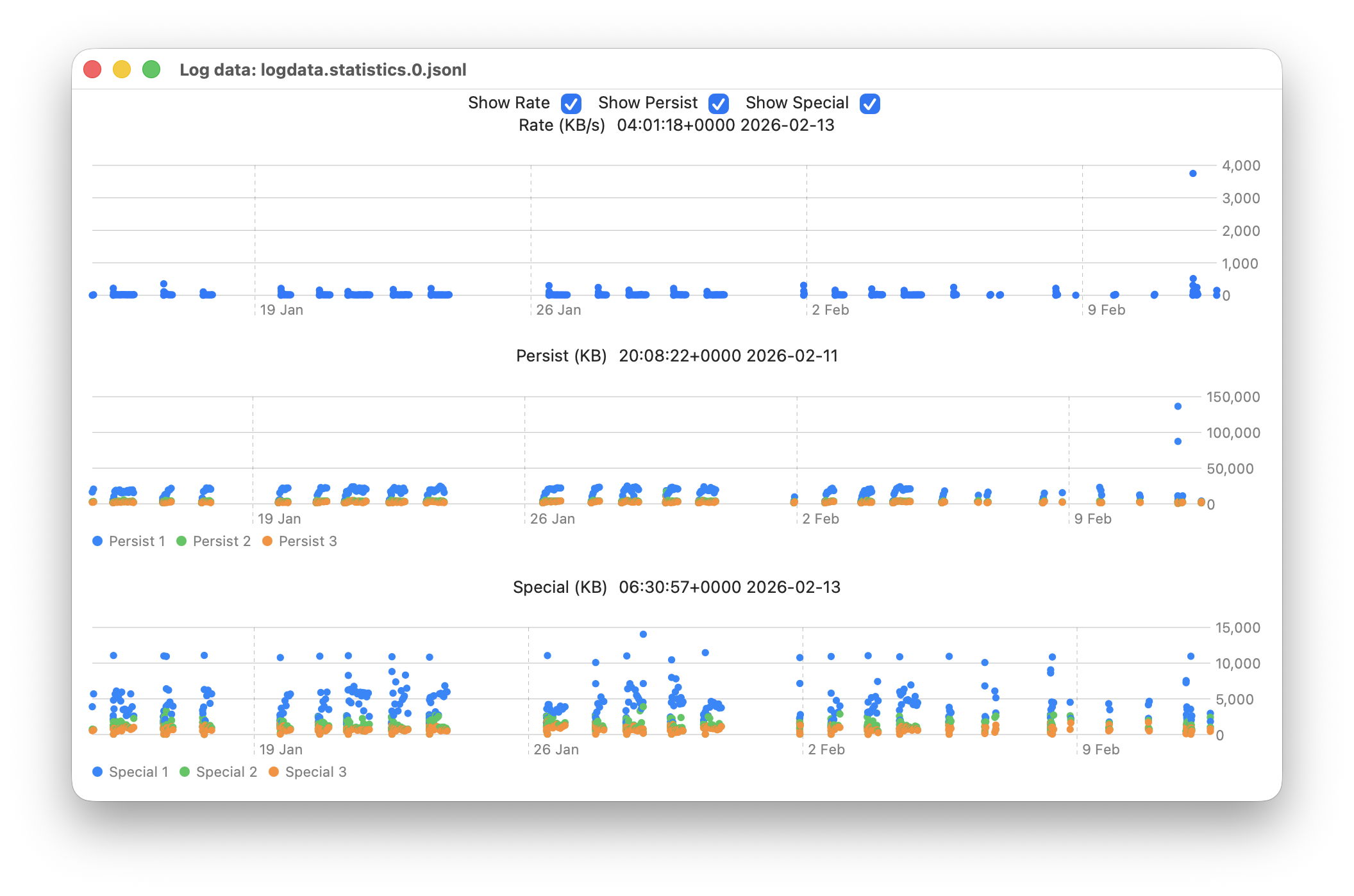
This displays any of three different plots:
- rate of log data written to Persist log files over the period for which log files are listed, in B/s;
- amount of log data written to Persist log files over that period, in KB;
- amount of log data written to Special log files over that period, in KB.
For the latter two, quantities shown are for the three processes that entered the largest data in that period. I have looked at identifying the processes concerned, but that’s far too complex to do here.
Signpost log files contain special types of entry intended to be used to assess performance, and contribute little to other analyses, so are excluded from these plots. Regular log entries are either saved to Persist or Special types, although it’s unclear as to which entries go to each. Some processes only appear to use one, although the entries for many processes can be saved to either. Although there are similarities in the patterns of Persist and Special files, they also differ in other respects. These three plots appear most suitable when looking for anomalies in the log.
Although these plots make it easy to identify the date of an anomaly such as the high outliers at the far right, for 11 February, they can’t tell you the time of the file you should analyse. For that, Logistician reports the time and date of the location that the pointer is hovering over. Place the pointer over the high rate value, for example, and you’ll see it occurred at about 20:14:00. This helps you identify which of the listed log files has that high peak rate, hence the time period to inspect using LogUI.
Traditionally, the moment you move the pointer from a chart area, hover information like that is removed. If that were done here, it would make it infuriatingly hard to refer to the list of log files. So these dates and times show those at the last moment the pointer was over that point plot. The knack is to hover over the point of interest, then move the pointer off that chart vertically, so as not to alter the time indicated. I’m looking at alternative methods of locking the time shown, to make that easier, but that presents more complex coding challenges, as do methods of zooming in on smaller periods of time.
In case you’re wondering, the overall period covered by these point plots, divided across the two log statistics files maintained, is approximately 6 weeks, as indicated by the X scales shown here.
Logistician version 1.1 is now available for Sonoma and later from here: logistician11a
and will shortly be getting its place in a Product Page and other listings here.
Enjoy!
Update: thanks to Jake for finding a divide by zero bug that could crash Logistician when opening a JSONL file. I have fixed this in build 14, now available above. Please download that and replace copies of the original build 12, so you shouldn’t encounter that crash. My apologies.
