

At the start of this series, I referred to paintings that feature blurred and sharp edges that don’t appear to correlate with any optical phenomenon, where the artist has apparently used controlled blur to draw emphasis, or control the gaze of the viewer. This article considers how this arose, and why this edge hierarchy has been used by some of the most masterly oil painters over the last century and a half.
I think its origins came when portrait painters started to differentiate more between subject and background in the eighteenth century.

Sir Joshua Reynolds’ portrait of Elizabeth, Countess of Warwick from about 1780 is but one of many examples where the background has become sketchy and far from sharp and detailed. Although Reynolds softens the edges of her face, the lines of her exuberant hat contrast with the noticeable blurring of the long vertical edge to the left of her, for example. But outside portraits, this type of edge control remained unusual.

It can be difficult to distinguish from depth of field effects. It’s hard to say which Jules Bastien-Lepage uses in his October or Potato Gatherers from 1878. This is a good example of his mature compositional scheme: high horizon, fine foreground detail, deep recession here enhanced by distant figures and by blur, and broad land.
Similar effects are seen in some of the paintings of Mykola Pymonenko from a decade later.
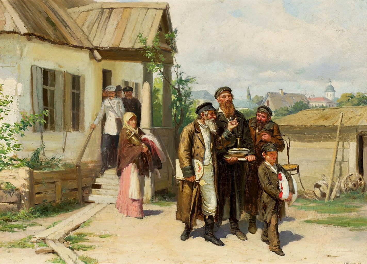
His painting of Jews Carrying Things Bought at Auction from 1885 shows a small group emerging from an auction with their purchases. These include a clock tucked under the arm of the man at the left, crockery and a chair. That foreground group are painted in fine detail, and edges are all crisp. The figures behind them, and the building, are less detailed, and their highlights, such as the bright reflections on the large cup held by the woman, are slightly blurred.
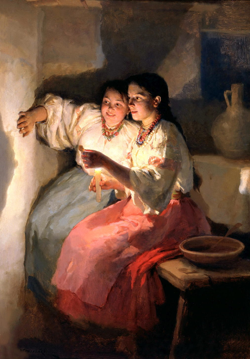
Pymonenko’s Yuletide Fortune Tellers from 1888 shows two young women playing a shadow game with a candle, which brings its own shadowplay in the magnified head and shoulders cast on the wall behind them. He paints fine detail in their faces and jewellery while their skirts are far more sketchy, and the jug at the right is quite vague and blurred.
Controlled blur was one of the features that Pierre-Auguste Renoir experimented with around 1887.
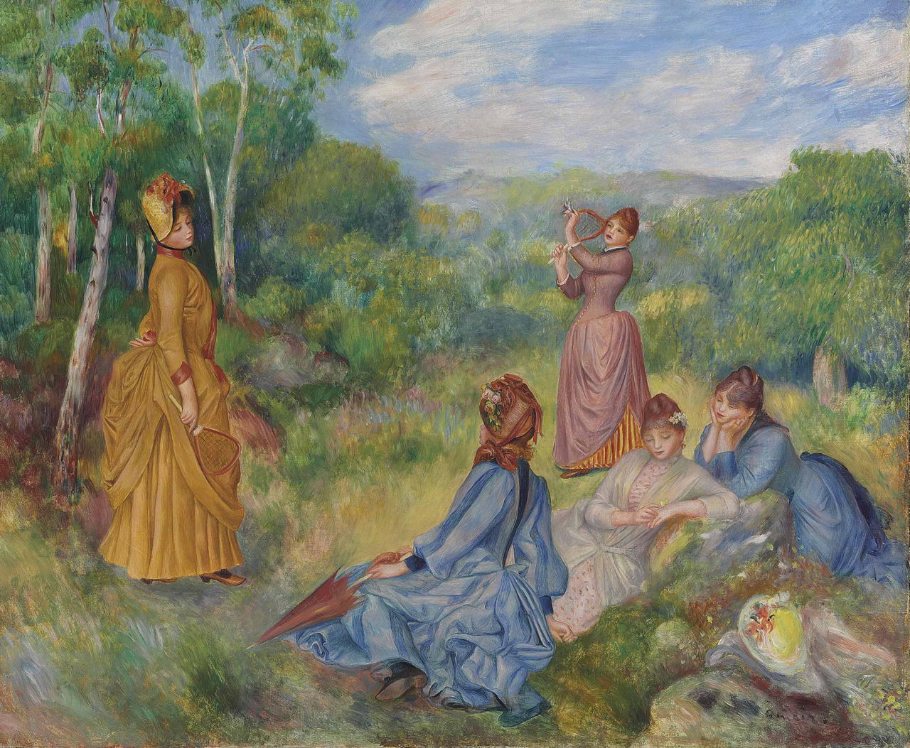
His new classically-inspired style, shown in these Young Girls Playing Badminton from about 1887, sets its figures so sharp against the landscape that they appear cut out. Sadly, this effect didn’t go down well with critics, or his dealer Durand-Ruel, so Renoir quickly abandoned it.
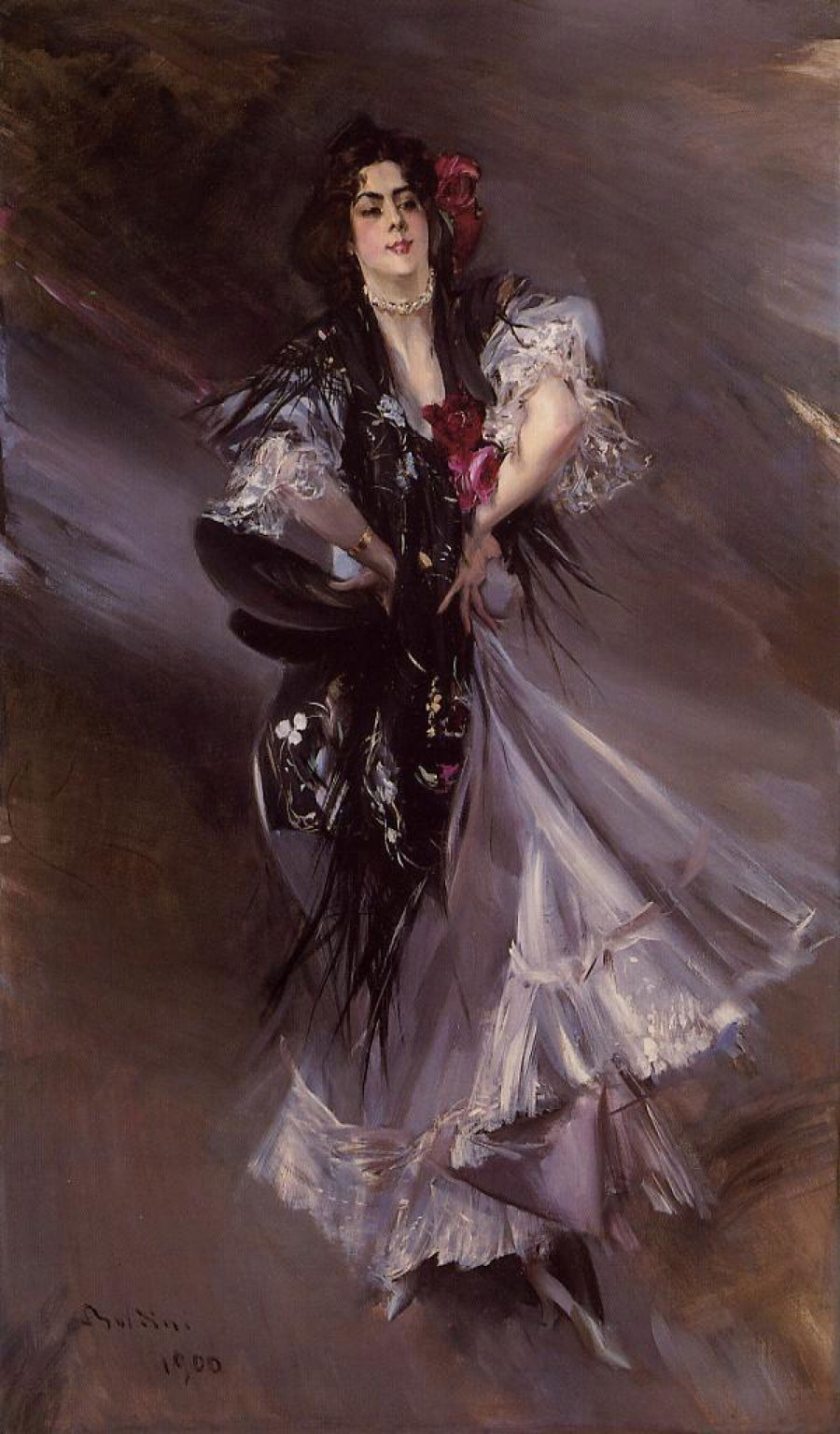
Giovanni Boldini compounded edge control with motion blur in this portrait of The Spanish Dancer from 1900.

Perhaps the clearest examples come in the oil paintings of Anders Zorn. His Self-portrait from about 1889 shows an optically impossible range of edges. Crispest is his jacket lapel below his face, where the near-white of the jacket contrasts most strongly against black. His other lapel, which is only slightly deeper into the field, is so blurred that it’s hard to say where it begins or ends. His left sleeve is also blurred, while the bust at the left is sharp. Those effects don’t correlate with any optical phenomenon, so are choices made by the artist.

Zorn’s Omnibus from the winter of 1891-92 might appear spontaneous and its loose brushwork a reflection of the speed with which it was painted, but was carefully planned and executed with great care in the studio. Once again, there’s careful edge control throughout, and great contrasts between their sharpness.

His portrait of Mrs Potter Palmer from 1893 shows her head and upper body in sharp focus, while other parts of her figure at the same depth in the image are greatly blurred. This is perhaps the logical extreme developed from Reynolds’ approach.
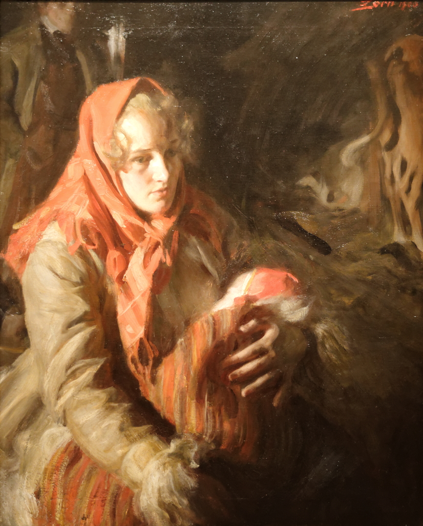
Zorn’s intimate portrait of A Mother and her Child from 1900 uses edge control to great effect.
In the twentieth century other oil painters have gone on to employ edge hierarchies as one of their expressive techniques. There are numerous artists who have written about how they use controlled blur in composition, just as they might use colour harmonies and contrasts. Vermeer’s influence lives on.
