

We’re remarkably good at recognising patterns, but awfully bad at making best use of that ability. This was understood during the last century, when countries were implementing their traffic sign systems. Rather than leave it to local authorities to decide how to warn drivers of hazards and restrictions, most countries evolved uniform signage designed to be recognised at speed, without the need for significant reading.
There has even been some degree of international agreement, so driving in other countries doesn’t require you to learn a new signage system. This is explained well in Wikipedia’s summary of the Vienna Convention on Road Signs and Signals. Signs are categorised into different classes, ranging from warnings of danger to information and directions, with extensive use made of shape, coloured borders, and symbols. In most, other than those containing directions and other information, words are avoided completely, except one: STOP.
Most of us take those for granted today, but in other situations forget how important they have proved. Take macOS’s alerts and notifications as an example. We’re repeatedly exposed to these, some of them of critical importance, but many less consequential. The end result, as some are candid enough to admit, is that we all too often click through them without knowing what what they said or what we’ve just agreed to.
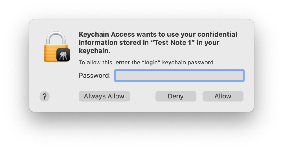
Last week I drew attention to two of the most consequential of these, displayed when an app requests access to a secret in a keychain, and when we’re prompted to enter our admin password for an app to be granted elevated privileges. Keychain access requests haven’t changed much in the last six years or more. Today you’ll see the following:
Run up a copy of Sierra from 2016, and this is what it looked like then:
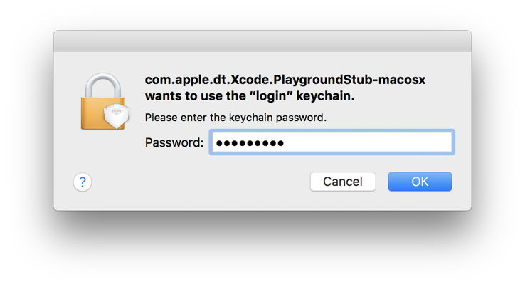
While today’s version is a little more complicated, and helpfully offers more options, these are recognisably similar patterns. This has also become more distinctive in Monterey and later, where almost all other alerts have adopted their novel, and widely criticised, vertical format. As a result, requests for authentication generated by macOS are harder to distinguish from the many others that flash past with increasing frequency. Their only truly distinctive feature is the miniature app icon superimposed on that of a padlock.

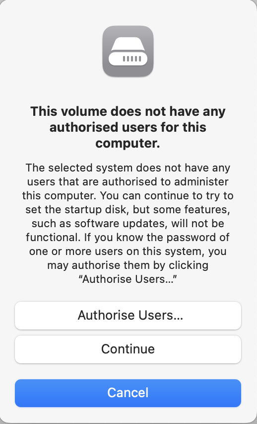
Where macOS security isn’t the source of the alert, icons used may be puzzling even on close examination, and it’s only when you reach the fourth sentence in a short essay that it becomes meaningful in the slightest.
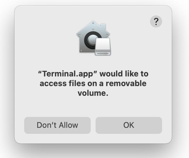
Or the icon shown might mislead you to think that alert had something to do with the Home app.
Meanwhile, Apple’s Human Interface Guidelines seem to have forgotten all the lessons of the last century, and the insightful edicts of their predecessors. When they appear to rank messages that warn when an action “might destroy data” alongside those giving “an opportunity to confirm a purchase”, it’s no small wonder that even macOS falls short. This has reached peak confusion in the widely shown example alerts seen in Sonoma betas.
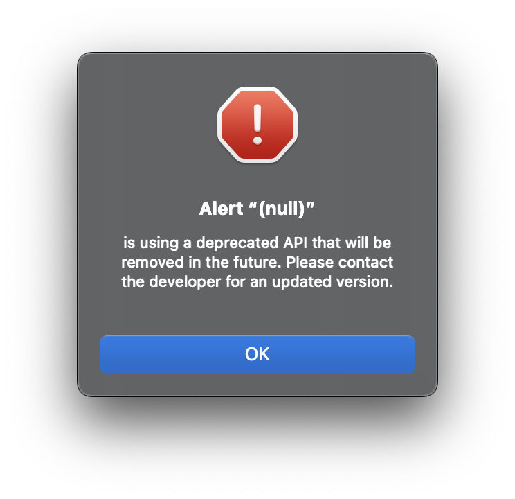
Even if this alert had been completed with meaningful and informative text, it’s just crying wolf, and only encourages click-through.
As the stream of alerts and notifications grows into a torrent in which the user is constantly swimming upstream, isn’t it time for Apple’s Human Interface Guidelines to address this using the human design approach that went into traffic signs over fifty years ago? And shouldn’t macOS be leading by example, rather than generating examples of how to confuse our pattern recognition?
What concerns me most, though, is that the USA isn’t a signatory to the Vienna Convention, but has its own Federal Manual on Uniform Traffic Control Devices, which has only been adopted in full by 18 states, and is at loggerheads with almost all of Europe. I’m sure macOS could do much better.
