
Many aspects of human colour vision are controversial, but few are as polarised as that of colour constancy. In Marc Ebner’s book titled Color Constancy, he claims that “a human observer is able to recognise the colour of objects irrespective of the light used to illuminate the objects. This ability is called colour constancy.” In his companion book, in the same series of technical reference works, Mark D Fairchild states that “colour constancy does not exist in humans!” In a way, they’re both right.
This goes back to the concept of the colour temperature of light sources. We’re all well aware, as are painters, that sunlight becomes redder or ‘warmer’ as the sun sinks towards the horizon at dusk, and becomes whiter or ‘colder’ when the sun is at its zenith in the middle of the day. For light sources, including the sun, this is captured in their colour temperature, which is the temperature of an ideal black-body radiator that radiates light of a colour comparable to that of the light source.
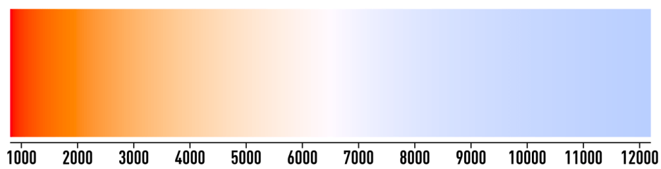
Although that’s fairly abstract and the numbers don’t in themselves mean a great deal, some examples may make this more understandable:
- 1850 K – candle flame, sunset or sunrise
- 2700-3000 K – fluorescent and LED lamps
- 3200-3350 K – studio lighting
- 5000 K – horizon daylight
- 6500 K – overcast daylight
- 15000+ K – clear blue poleward sky.
Expressing these in Kelvin rather than Celsius or Fahrenheit only adds to their air of unreality.
Photographs and paintings, as they don’t emit light, don’t have colour temperature as such, but a corresponding white point. This corresponds to the actual colour of a true white in the image. When that’s redder, the painting is considered to be warmer in colour; when bluer it’s colder. When painted faithfully to the lighting conditions at the time, a painting of a sunset should have a warm white point to reflect the lower colour temperature at the time. Unfortunately, that means warmer is paradoxically lower temperature, but that’s how the physics works out.

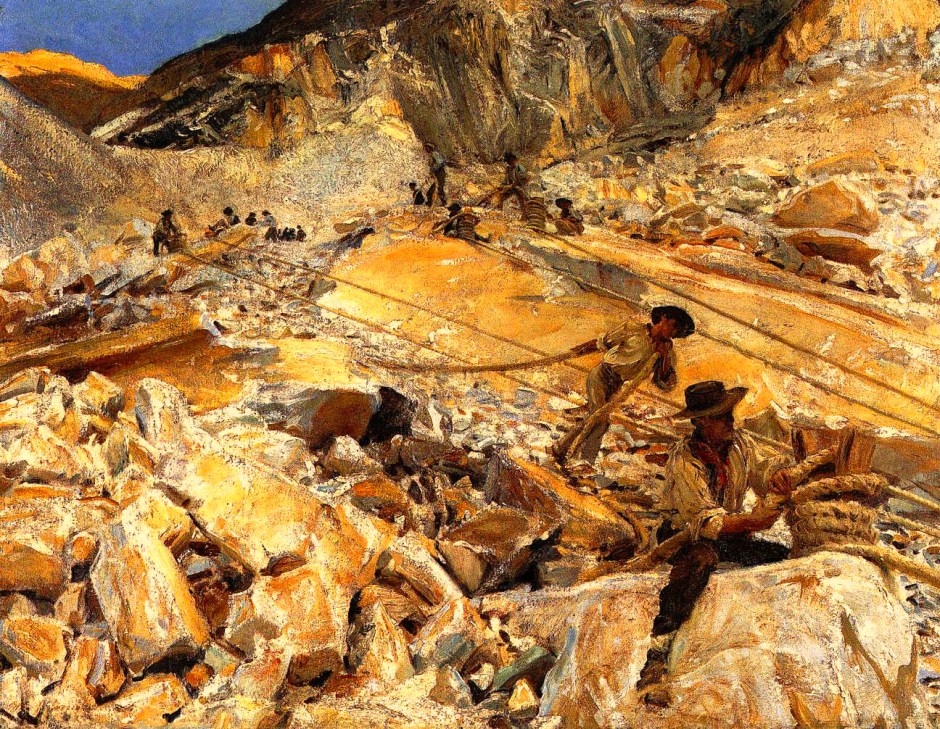
You can see the effect of changing white point in Sargent’s Bringing Down Marble from the Quarries in Carrara (1911). Above is an image which appears fairly accurate in its colour balance, compared to the original painting.
Take its white point down 30% to warm the white point, and it looks as if it was painted closer to dusk.
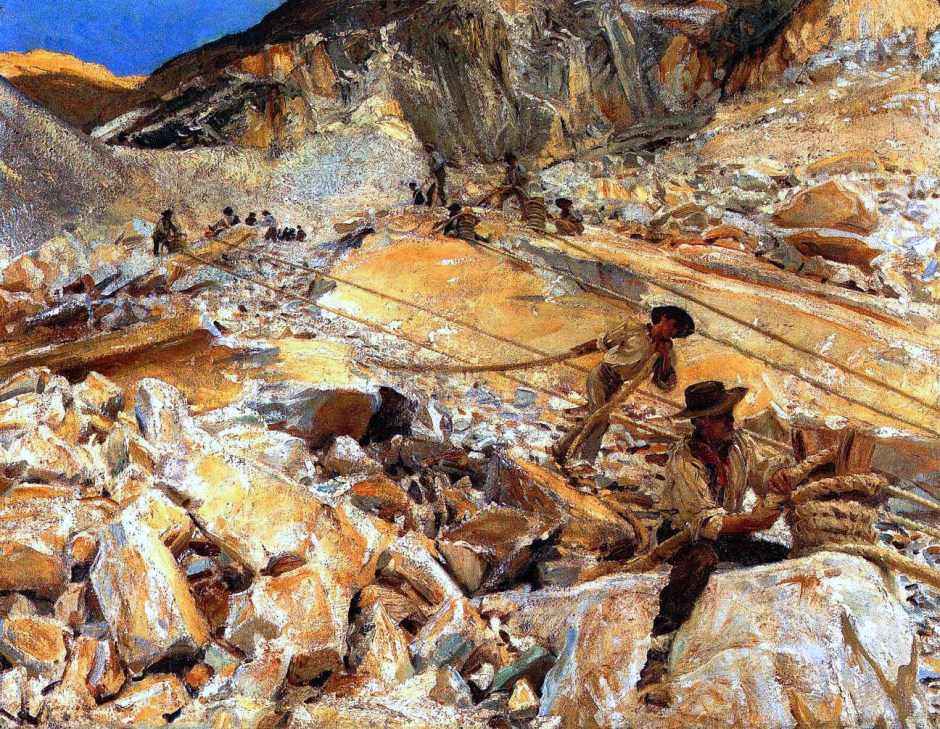
Shift the white point higher by 30% for a cooler white point, and it appears to have been painted in the middle of the day, with sunlight at a higher colour temperature.
Colour temperature and white point are most significant when ambient light is lower in intensity, for example coming from candles. While we must also be cautious here, as our cones are becoming insensitive and our vision more scotopic, here are some examples.


Georges de La Tour’s Penitent Mary Magdalen (1628-45) is lit by the flame of a single candle, giving a colour temperature of around 1850 K, and the redness you’d expect. The two colour patches show its white and black points, which appear remarkably accurate.


While Adolph Menzel’s Concert for Flute with Frederick the Great in Sanssouci (1850-52) is lit by brighter chandeliers, their colour temperature is little higher, and the artist has made a similar adjustment to its white point. This is interesting, as the chandeliers are seen to be providing white light, as you’d expect with colour constancy. There’s a wonderful example of these effects in Stanley Kubrick’s movie Barry Lyndon (1975), many of whose interior scenes were shot by the light of actual candles.
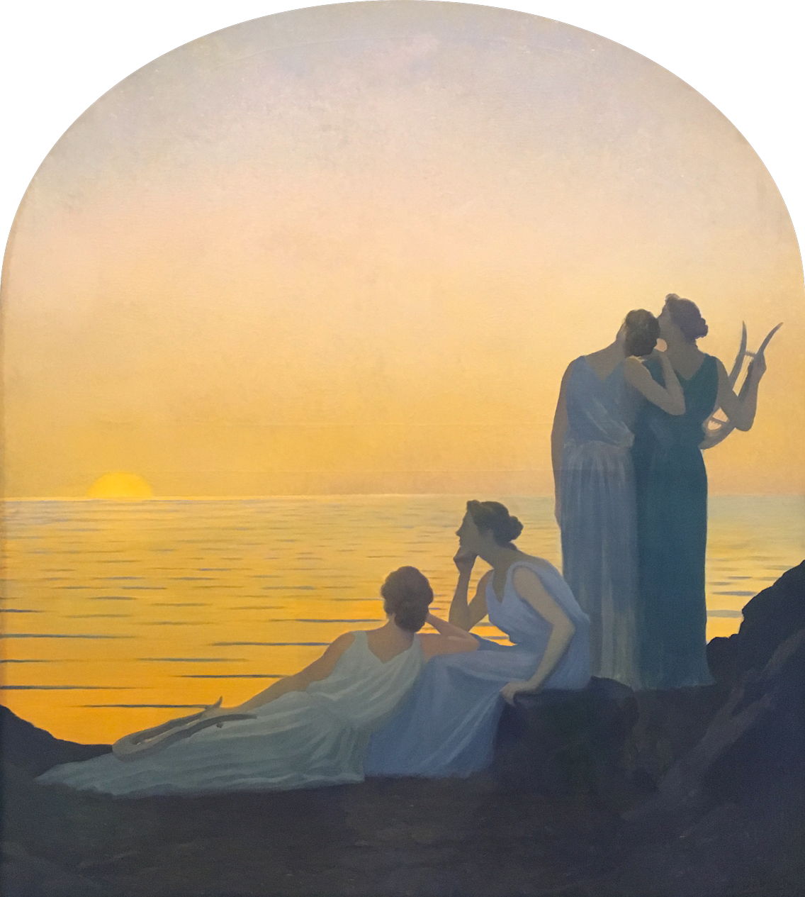
Classically trained painters like John Singer Sargent also learned about tonal values, lightness and darkness in their paintings. Although unusual lighting conditions and artistic choice can result in narrow tonal ranges, most paintings are intended to have values ranging from purest white to darkest black. This becomes evident when you view Sargent’s Bringing Down Marble from the Quarries in Carrara in monochrome.

Colour becomes more complicated when viewing objects whose colours we recognise, despite a very different colour temperature and white point.

In Petrus van Schendel’s wonderful Market by Candlelight (1865), we see clearly oranges, coloured orange, in the baskets being carried by the young woman in the foreground. On the table at the left are some ripe apples, which are red and green as we expect them to be, and green vegetables. Except they’re not: the true colours are shown in the patches below. The upper pair show the white and black points for the image, and below them are, from the left, the colour of oranges, the red of the apples, and their greens.

So, do we enjoy colour constancy? We certainly have sufficient to recognise our car when we return to it under very different lighting conditions, and to see white paper as white throughout the day and night. We recognise objects by their colour, as shown so well in the paintings above. But when colour matching or making critical decisions, we’re likely to get it wrong when under light of different colour temperature. Who hasn’t bought clothing that looks the right colour when inside the shop, only to discover it’s rather different when we step outdoors into the cold light of day? It was all a trick of the light, which is just what painting is, after all.
References
Wikipedia on colour temperature.
Marc Ebner (2007), Color Constancy, Wiley, ISBN 978 0 470 05829 9.
Mark D Fairchild (2013), Color Appearance Models, 3rd edn, Wiley, ISBN 978 1 119 96703 3.
