
Painters have long been concerned over their materials, including changes which occur in the colour of some pigments over time. Among the first to write about these was Cennino Cennini, in about 1400, who gave lengthy advice on problems well known at that time. Because painting was centred on workshops and was administered by exclusive guilds, the empirical secrets of good craftsmanship were passed on orally, from master to apprentice, and few attempts were made to compile and promulgate good practice. A good example is the use of indigo.
Prior to about 1625, the use of indigo in oil painting was relatively limited, and principally in underlayers to model the folds of fabrics. Then, in about 1627, Frans Hals and other Netherlandish artists started to use it more generally, and in the upper parts of the paint layer, where it was more exposed to light and atmospheric pollutants. Demand for indigo from India rose, it’s probable that pigment manufacture became less diligent, and supplies may have been mixed with local woad, which is notoriously fugitive.

In Abraham Bloemaert’s The Adoration of the Magi from 1624, the cloak of the Virgin Mary appears to use two different blues, with its lower passages painted in the duller hue of indigo, which has faded slightly. Examination of the paint layer has shown that the artist used a beige ground, onto which he painted a thin layer of indigo blue mixed with lead white.
Bloemaert then modelled the folds using a red pigment for shadows, and lead white for brights. Over that, he painted a finer-modelled layer of ultramarine, with lead white for highlights. There were then several thin glazing layers of ultramarine applied to generate the rich blue, following traditional technique.
The dullest areas are those which had the thinnest ultramarine glazes applied, much of which have now abraded away during subsequent cleaning of the painting. The unprotected indigo has therefore suffered sufficient exposure to fade slightly, as well as losing its rich glazes.

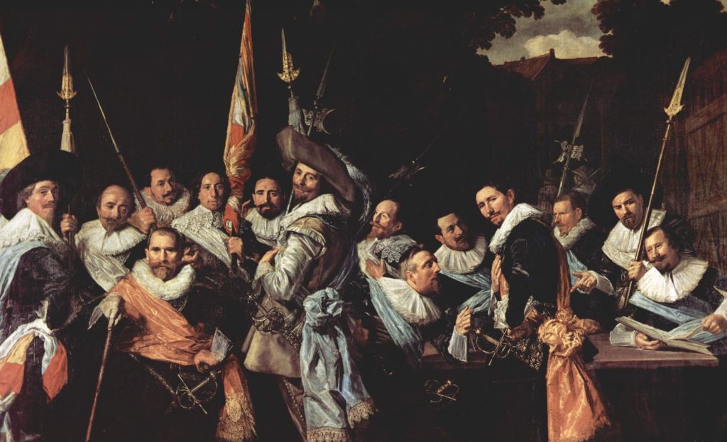
Hendrik Gerritsz Pot used the novel technique of putting indigo layers over underpainting, without the protection of glazes, in his Portrait of the St Adrian Civic Guard, Haarlem from 1630. As a result of fading of the indigo, what were originally bright blue sashes have become almost white, as shown in the detail below.


Frans Hals’ Officers and Sergeants of the St Adrian Civic Guard (1633) not only shows the same group of men, but has suffered exactly the same fate with their formerly blue sashes.

The oddly-coloured tablecloth in Verspronck’s Regentesses of the St. Elisabeth’s Hospital (1641) was originally a rich green. Unprotected indigo blue has faded from much of its surface, leaving most of it an odd yellow ochre hue.
When artists’ colourmen started supplying paint to painters in their studios during the eighteenth and nineteenth centuries, they took the permanence of pigments more seriously, but still didn’t attempt any more systematic studies. What prompted those was the rise of national collections of art, in particular the bequest by JMW Turner of a great many of his works to the British nation. This coincided with the involvement of chemists and other scientists in what has now become the conservation of art. Among them was George Field, who published a book on what he termed chromatography in 1835. A few painters were sufficiently concerned to start performing their own tests for lightfastness as a result, but little changed.
In Britain, this reached a peak in the 1880s, when there were great concerns over the permanence of Turner’s watercolours. As a result, Walter Russell and William de W Abney were commissioned to investigate this, and in 1888 their report was brought before the Houses of Parliament, as it was considered of such great importance to the nation.
Russell and Abney exposed samples of watercolour paints using specific pigments to prolonged periods of full sunlight and daylight which was estimated to be equivalent to nearly five hundred years of exposure in one of the public galleries. Among the least stable of the pigments were carmine, crimson lake, purple madder, scarlet lake, and indigo. Some pigments showed no discernible change, including Prussian blue and ultramarine. They also looked at the contributions made by humidity and oxygen to fading, and concluded that both were, in general, essential for fading to occur.
This sparked intense debate, and the new manufacturers of artists’ paints such as Winsor & Newton started to evaluate lightfastness more systematically. The first standard for lightfastness of artists’ paints was set in Germany in 1907, but unfortunately used alizarin crimson as its baseline, a pigment derived from some of those already shown by Russell and Abney to be fugitive. It wasn’t until 1984 that the American Society for Testing and Materials (ASTM) finally published a set of standards which have since become used internationally. There’s also a Blue Wool Test, which is simple enough for any artist to perform, although not as rigorous as ASTM equivalents.
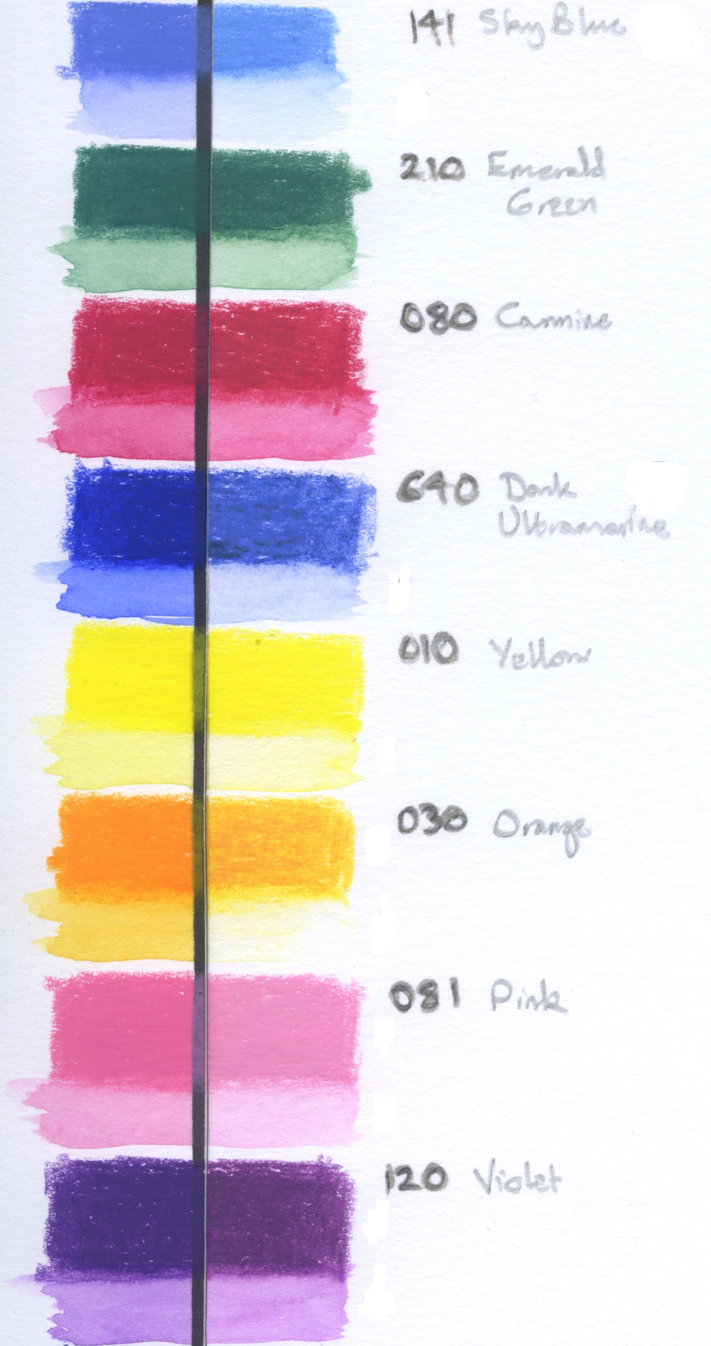
A few years ago I performed my own lightfastness tests on a range of wax crayons aimed at the ‘serious’ end of the market. Like many manufacturers, the European company that makes these crayons didn’t publish any information about the lightfastness of their products.
My tests were simple. All I did was apply each crayon in a heavy band, and paint out a dilute band below. Sections to the left of the black line were kept covered with thick card, while those on the right were exposed to sunlight and daylight for a period of about two months. You don’t even have to measure the patches using a spectrophotometer when colours fade as easily as those shown.
For over six hundred years, artists have known that some pigments are more permanent than others. Science has provided considerable information, and research continues. Yet many suppliers still haven’t recognised the importance of providing professional artists with paints which retain their colour reliably.
