

Not everyone can afford to have a graphic designer create their timelines for them, and sometimes even graphics professionals can benefit from advice. This is a short compilation of suggestions which should improve your timelines, together with some examples of where I think there was room for improvement. I apologise in advance to those whose work I am showing here, but hope that it will help me make my points.
Is a timeline the right chart?
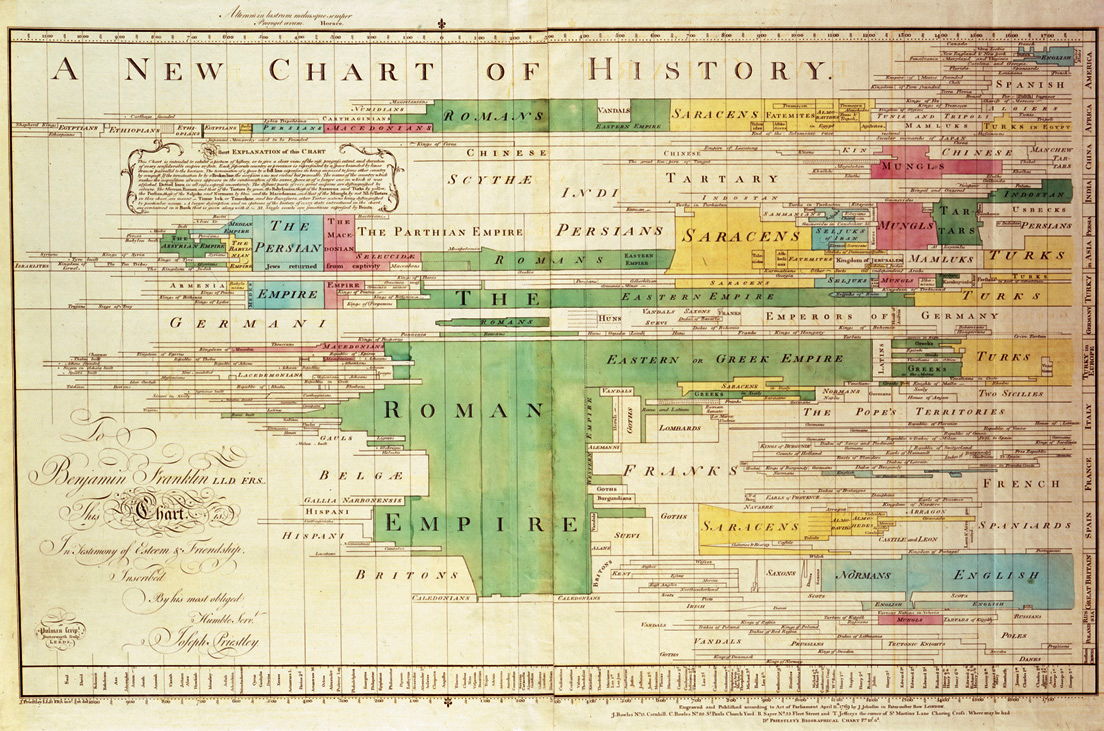
Those familiar with the writing of Edward Tufte will know the first question to be put against every timeline: does the amount of data justify the space occupied by the timeline?

In this case, it may have been simpler, clearer, and more concise to have simply tabulated the years.
If you are going to create a graphical representation of events occurring over time, then a timeline is a well-recognised means of doing so. Don’t go it alone and try to invent something new unless you are certain that it is going to be superior to a well-designed timeline.

The time axis
One of the few essentials of any timeline is a clearly-labelled time axis. It saves you from having to label the events and periods with their times or dates, which greatly reduces the clutter and improves the readability of the chart.
That time axis can be horizontal or vertical. If horizontal, for languages that are written left-to-right, put the earliest time at the left, and the latest at the right. Vertical timelines can run up or down, so long as that direction is kept consistent within a given document or site.

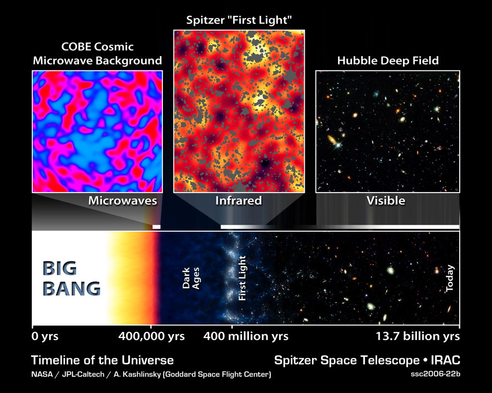
The time axis should space time values regularly. Normally these should be linear (equal distances on the axis for equal periods), but in some circumstances it may be highly desirable to make the axis logarithmic: below, when working in a cosmological timescale.
Unfortunately a lot of timelines skip or squeeze periods which seem uninteresting, resulting in a non-linear time axis.


If there is a cluster of events close to one given time, and a long gap before the next, you may get away with interrupting the axis with a small gap, but that should be exceptional. Never make the spacing irregular, as time is universally agreed as proceeding at a uniform pace.

It is sometimes tempting to combine two timelines proceeding at different rates into one, as if the faster can be ‘zoomed’ into the middle of the slower. You might be able to get away with this using a magnifier in an animation, but when tried in most static timelines it becomes confusing, as shown above. It may be better to put the two timelines above one another, one shown as a magnification of a section of the other.
Label the times sensibly: sufficient labels to be clear, but not so many as to clutter the time axis up with the labels. Where helpful, duplicate the axis ticks and labels on the other side of the timeline, and consider adding vertical or horizontal gridlines spanning the timeline if that will help the viewer.

Where it might be helpful, consider expressing elapsed time in a different way on one of the two sides of the timeline. Here the lower axis gives absolute year, the upper the age of that individual: a very helpful addition when dealing with events for a single person.
Under no circumstances should you ever superimpose two timelines using different bases for their time axes: it will be disastrously confusing.
Events shown
Make it easy for the viewer to be able to work out the time of each event, by tracing that event to the time axis. If you use reasonably small points to mark each event, that should not be hard, but if the events contain images or more, run a line from the correct time of that event to the time axis to make this unambiguous.
Where an event has a duration which would be visible over the scale of the time axis being used, indicate that as a period rather than a single point event. Ensure that the start and finish of the period are correctly aligned against the time axis, using perpendicular lines running to that axis if necessary. If the start or finish are uncertain or vague, indicate that by a section of broken line at the appropriate end of the period. Do not use any marks derived from brackets, such as curly brackets, to indicate period events unless you have very good reason not to use a simple line.
Similarly, intermittent events can be indicated by a section of broken line for the period over which they occurred.
Event trees
Where events branch, such as in tree-structured timelines, be very careful about how you show branching. Some viewers may expect the point of branching to mean something which you do not. Avoid using faired curves which might look pretty but could mislead.
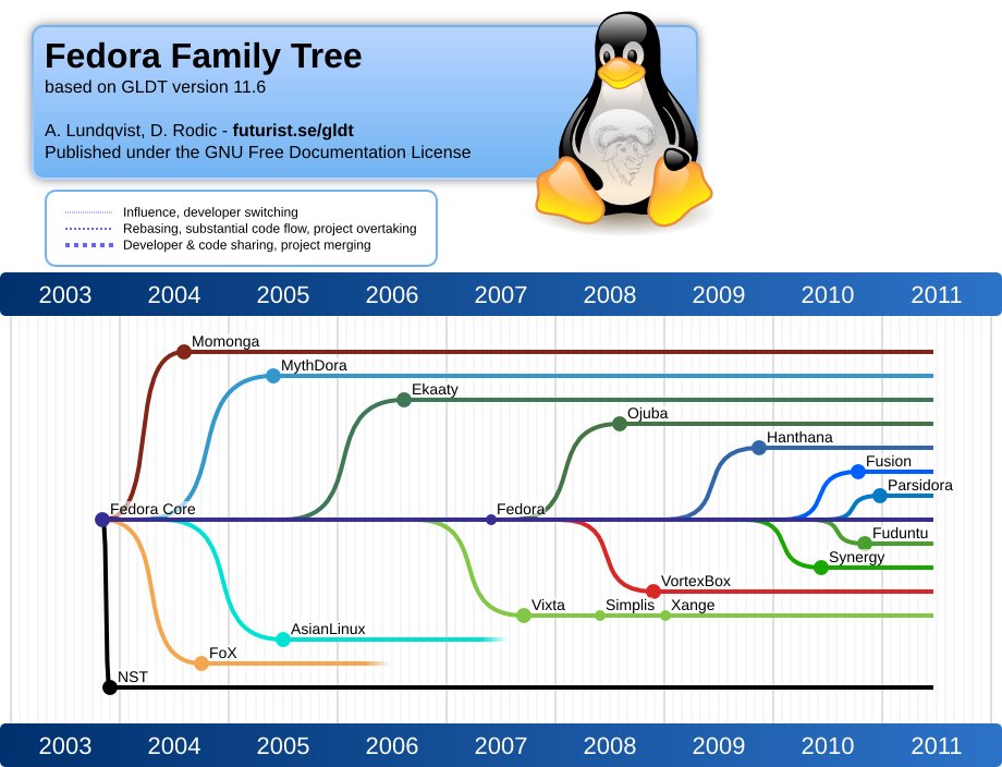
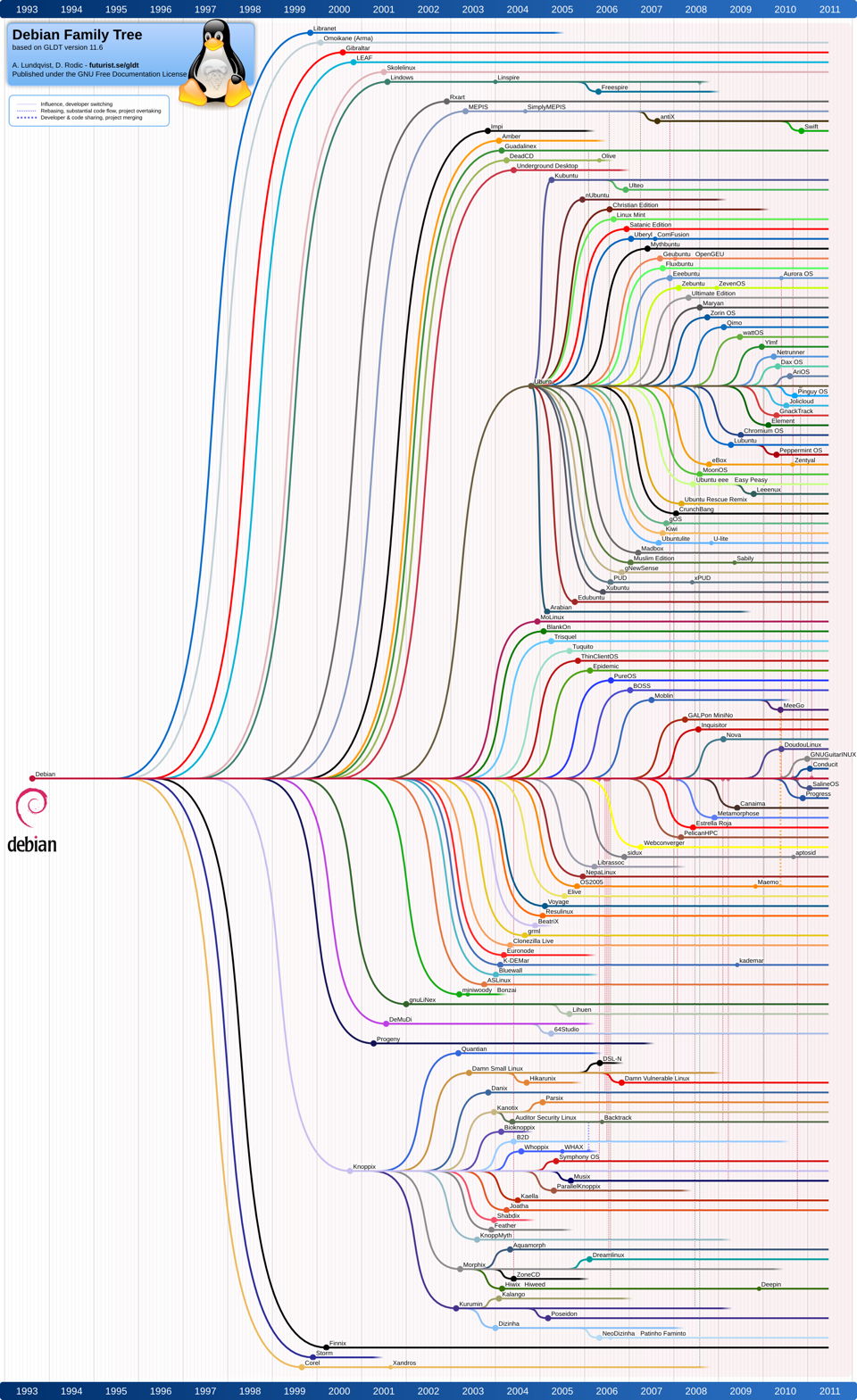
Straight line branching may look less artistic, but in the long run is much better for the viewer.

Do not put arrows into such branching trees (above) unless they have inherent meaning. The existence of a branch and the unidirectional march of time already make it clear what a branch means. However, where some branches may influence others, an arrow indicating the direction of influence is valuable.

Branching can sometimes be avoided by placing nodes along a period event: for example, where a product has gone through a series of versions or revisions, you can indicate the appearance of those versions along a single line, rather than branching it out into a tree. Although complex trees may look impressive, their information density may be quite low, and they are often very difficult to read properly.
Areas and colours
Generally speaking, the more complex the timeline, the less you should be tempted to colour any areas of it in, unless doing so adds information (and value). Viewers are likely to be left in a quandary as to whether the area which is coloured in, or the breadth of the area, have any numerical significance, and if so, how they can compare two areas of similar apparent breadth. If you need to indicate changing continuous variables along a timeline, then perhaps you would be better off with a more general time series chart, than a timeline.
Finally, ensure that your timeline is as readable by someone with impaired colour perception as it would be to someone with normal colour vision. The use of broken lines is likely to be ambiguous in meaning, suggesting that an event was dying out or insignificant. However careful choice of chroma and lightness rather than just hue, can go a long way to help those with the more common forms of impaired colour perception, particularly red-green colour blindness.
If you can think of other rules of thumb or tips for good design, please add them here as comments, or mail me.
Reference
Rosenberg D & Grafton A (2010) Cartographies of Time, A History of the Timeline, Princeton Architectural Press. ISBN 978 1 61689 058 2.
