
After lightness comes hue…

Terms
Hue is the type of colour, such as red, yellow, etc., or a mixture of colours forming an intermediate. More formally it is the degree to which a perceived colour is similar to or different from those perceived as being red, green, blue, yellow (the four unique hues), orange, or violet (the remaining hues of standard scales).
Physical measurements of colour using devices such as spectrophotometers measure the amount of light at different wavelengths in the visible light spectrum, typically producing a power spectrum. As there is no simple and direct correlation between a measured spectrum and the colour which we perceive from that, these are of limited usefulness for trying to gauge our perceptions.

When coupled with chroma, the physical measurement of colour can be expressed as chromaticity, as shown in the CIE 1931 chromaticity space, for example. Although this attempts to include all the chromaticities which can be perceived as colours by humans, it is a physical and not perceptual model.
Note that the term ‘hue’ is often used in quite a different sense in painting: when a paint manufacturer simulates a particular named colour using different pigments, then it is convention that the name of the simulated colour has ‘hue’ appended to it, to indicate that it does not contain the pigment normally associated with that colour. For example, a cadmium-free version of Cadmium Yellow would normally be named Cadmium Yellow Hue.
Basic perception
Most people can distinguish several million different colours; this is hard to assess directly, but easier if their lightness is held constant, in which case for each lightness value we can distinguish about 17,000 different combinations of hue and chroma.
However most of us consider that there are four ‘unique hues’ (in addition to black and white): red and green are perceived as being opposites, and yellow and blue as the other pair of opposites. Perceptive colour scales may therefore attempt to measure hue on two scales, red-green and yellow-blue, which is exactly how L*a*b* and related scales work. Other widely named colours such as violet/purple are then seen as a mixture of a proportion of red and blue, orange as a mixture of red and yellow, and so on.
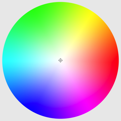
An alternative model for colour scales is to arrange the colours according to the visible light spectrum. This is often done in a circle, sometimes with maximum chroma at the perimeter and zero chroma (white-grey-black) at the centre. Colours can then be specified according to their position on the circle. The simplest way of achieving that is to label the perimeter of the circle with zero and red at the top, then to pass through the spectrum of yellow and green to cyan at the bottom, and back through blue and violet to red at the top. The angle subtended on the perimeter is then a numeric value representing hue, with:
- red at 0˚
- yellow at 60˚
- green at 120˚
- cyan at 180˚
- blue at 240˚
- violet at 300˚.
This colour circle, which originated with Newton in 1704, is quite different from those proposed by Chevreul and others for colour harmony; in a standard hue circle, opposing pairs of colours are red and cyan, yellow and blue, green and violet.
Metamerism is an important concept in colour mixing. Because we do not perceive anything directly related to the spectrum of light seen, but perceive a hue based on the dominant frequency as detected by the three types of cone sensors in the retina, there are many different ways in which any given perceived hue can be generated.
Colour terms
The English language, and those of most of the Western world, have a seemingly inexhaustible supply of names for different colours and their shades. Visit an artists’ suppliers, fabric shop, even a car showroom and you will experience some of these. Unfortunately there is no universal rigorous system which relates any given colour name to any particular hue. Furthermore individuals differ in the way in which they attribute colours to parent or unique hues. My blue may be your green, and your pink may be my violet.
Thankfully paints are usually named after the pigments which they contain (or according to generally accepted combinations, such as Payne’s Grey), and this limits the range of colours associated with any given name, such as Ultramarine Blue.
Other languages may not have the same abundance of colour names, and some have tried to conclude that indicates differences in perception or processing of colour between ethnic or other groups. More careful studies have shown that this is not the case. The fact that, until recently, Welsh did not have its own word for pink or purple does not indicate that people of Celtic ancestry in Wales have any defect in their colour vision. It simply means that, as a language, no such words were coined. Other than those with specific abnormalities of colour vision, there is no evidence that any particular group of humans differs in any systematic way in its perception of colour.
You can read an account of a recent flawed claim on a BBC documentary here.
Importance
Hue is a primary means of gaining clues as to the nature and identity of a coloured object within our field of view, and step changes in hue are dominant factors in determining edges and thus composing what we see into a world of objects.
By the time that we acquire language, those with normal colour vision have constructed an expectation of the hue of a large number of everyday objects, including the sky, flesh, vegetation, parts of human and animal bodies, and much more. Seeing markedly different hues, such as a brilliant red sky at dusk or dawn, may trigger positive emotions and be deemed aesthetically pleasing. However most people would consider other hues, such as a brown or bright green sky, to be disturbing and unsettling.
Progressive changes in hue are also a common feature of aerial perspective, in which more distant objects tend towards the blue end of the visual spectrum; these are usually referred to as ‘cooler’ hues, i.e. towards the blue, rather than ‘warm’ or red end of the spectrum.
The use of thermal terms such as ‘warm’ and ‘cool’ reflects complex and variable associations we make with particular hues. However these are highly contextual. Greens, for example, are often associated with grass and countryside, and generally taken as a ‘calm’ and ‘natural’ hue. But when slightly more yellow and in different contexts, viewers may consider them insipid or even sickly. These can be important, as viewing a hue under different types of illumination may change its perception, even in the face of ‘colour constancy’.
Illusions and interactions

Hue interacts with lightness in the determination of edges, which can result in complex effects and illusions. There are many other illusions based on hue, including those of simultaneous contrast effects, which are also observed in greyscale alone.
‘Colour constancy’, as with ‘lightness constancy’ (previous article), is not absolute. Whilst it is true that we perceive an orange (fruit) as being orange in a wide range of natural lighting conditions, extremes of artifical lighting will break this constancy. It is also seen most reliably in objects whose colour is well known, and relatively invariant. The colour of cars, for example, is less well preserved by colour constancy than that of fruit.
The most complex and controversial issue over hue is that of ‘colour harmony’, which has spawned many claims and a heavy literature. Although it is undoubtedly true that certain combinations of colours may appear well-suited to one another, and to ‘go together’, claimed ‘rules’ of colour harmony lack sound objective evidence. One person’s harmony might be another person’s contrast or even clash.
Comparison of different harmonies proposed over time also reveals contradictions, resulting at least in part from different layouts of colours around the colour wheels on which their theories depend. Newton’s original colour wheel of 1704 gives red – blue-green, indigo – yellow, and violet – green as complementary colours. In 1861, Chevreul used a different wheel based on Goethe’s, in which red – green, yellow – violet, and orange – blue are complementaries. Itten (1921) offers more complementary pairs, including yellow – blue-violet, orange – ultramarine, vermilion – cyan, crimson – blue-green, purple – green, and purple-violet – yellow-green.
As if hedging their bets, some colour theorists propose complementary (opposites on the wheel), analogous (adjacents), triadic (forming a triangle), and other harmonies, in which ultimately any colour is deemed harmonious with any other colour. These are visualised here.
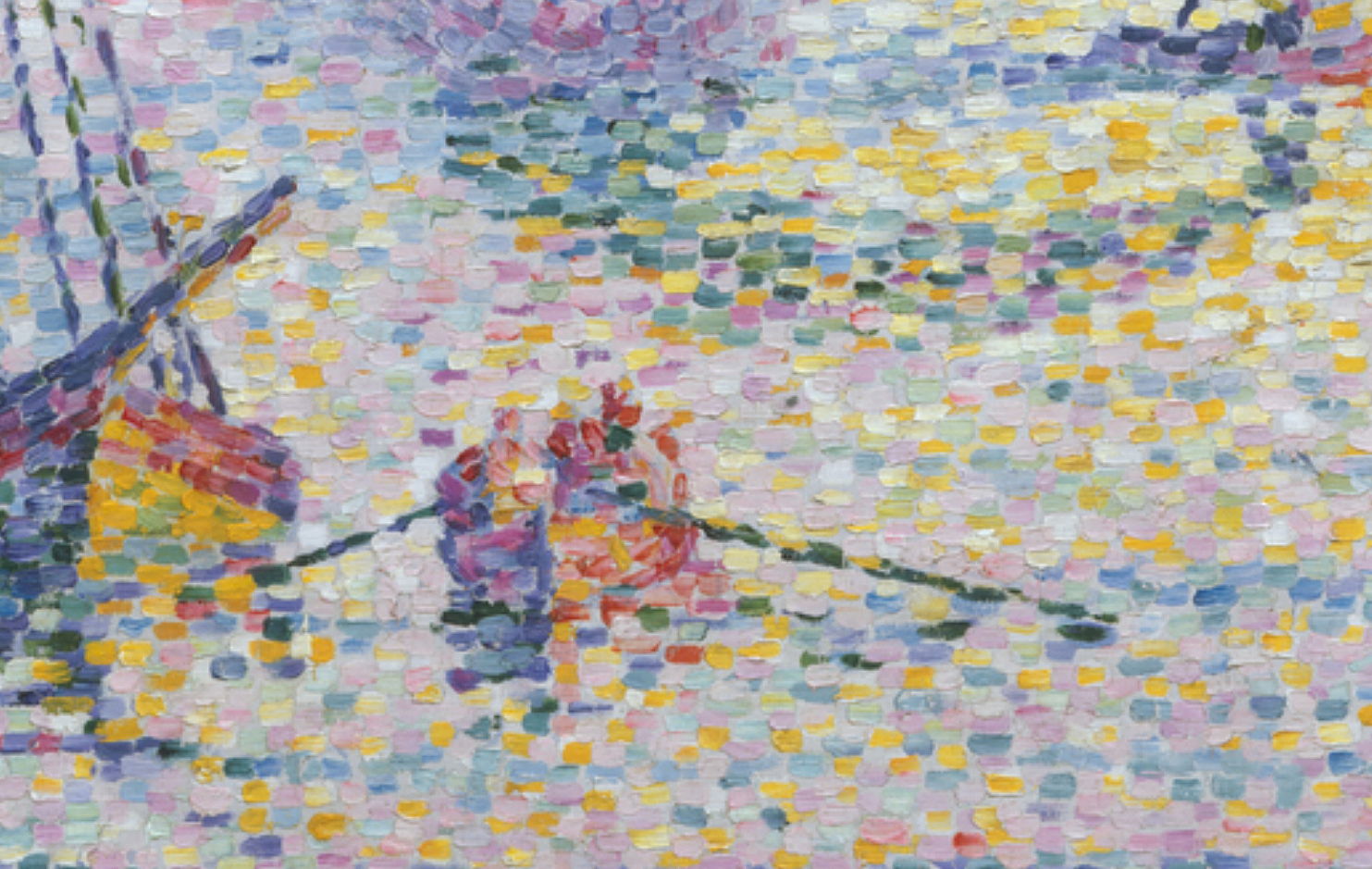
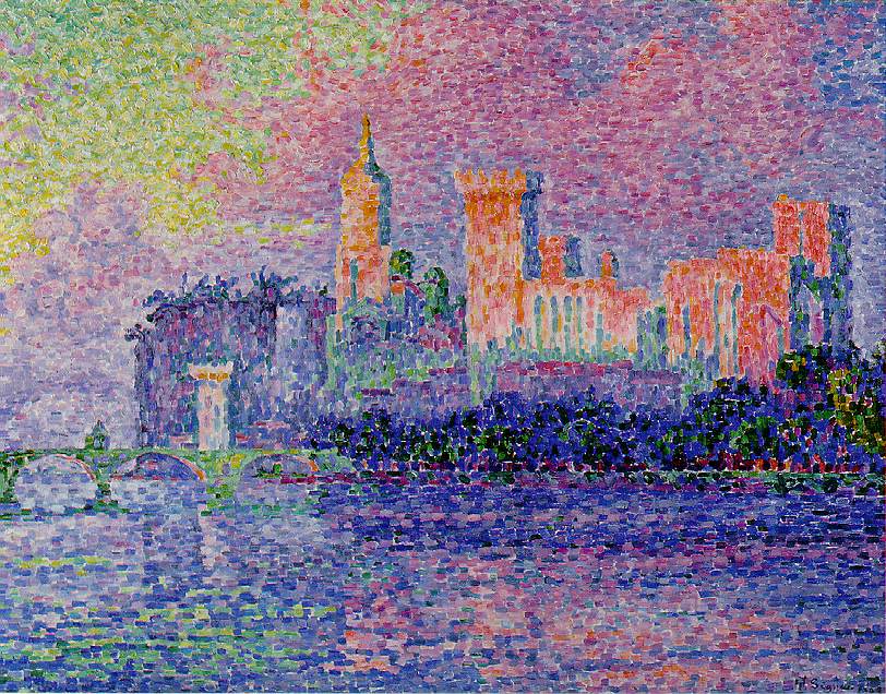
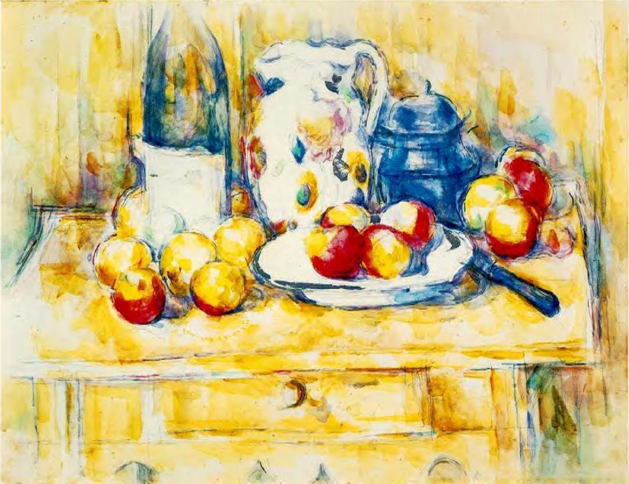
The ultimate experiment in the effects of adjacent hues on perception was probably that of Divisionism (pointillism), where the tiny dots or tiles of colour were usually intermingled to try to cause ‘optical blending’. Some observers see the resulting areas of colour ‘shimmering’ and ‘vibrant’, but this is by no means universal, and may require careful attention to the right lighting conditions.
Painting solutions
Colour perception is altered by adjacent colours and changing light, as ‘colour constancy’ is lost in extremes. As with lightness, these effects come into play when studying the colour composition of a motif. As with ‘lightness constancy’, when a painting is considered it is too small to create a constancy of its own, in the way that a full motif does. A painting is therefore less able to benefit from constancy effects, and more prone to the interaction of colours which are brought together in closer proximity than in nature.
It is therefore important during painting to adjust the hues used to ensure that effects shown on the canvas adequately reflect what you see in the motif, and your own interpretation of it. This is less about precise colour matching than creating the right effect.
Choosing the right colour paints and constructing your palette correctly are also important, and I will return to these when I cover pigments and their mixing later in this series. However as a general principle you should ensure that the hues offered in your paints cover the full spectrum which you wish to depict. If you were to omit all reds, for instance, you cannot mix a red from other colours, and would need perhaps to substitute a reddish earth, which would make your painting appear very different.
In general a palette needs to include colours close to the unique hues of red, yellow, and blue at the very least, for it to have general utility. It is wise to add white (unless working in transparent watercolour alone) and black, and the fourth hue of green is often helpful, particularly when painting landscapes with vegetation.
The order in which you place colours on your palette should be consistent, so that you know exactly where each colour is, but need not follow a fixed sequence. Logically it might follow the standard colour wheel, progressing from red, orange, yellow, green, blue, to violet. You may wish to place earth colours after that main colour sequence, followed by greys and black.
However most paint manufacturers give colours in the order lemon, yellow, orange, red, violet, blue, green, earths, greys, black, and that is a sound a very popular order for the palette too. This is a matter of personal preference. It is though important to eliminate colour interactions, so placing similar hues adjacent to one another is the best strategy.
The palette itself, and any other surface on which you mix colours, should have be achromatic to eliminate any risk of simultaneous contrast and other interaction effects. Although there are good arguments for choosing a palette which is grey rather than white, most prefer white or light grey, particularly when painting on white or light grounds. Traditional brown wooden palettes remain very popular, though, and are relatively free of colour interactions. I have heard of a vendor offering gold palettes, which would clearly be disastrous for use with real colours, and absurdly ostentatious.
Trying to achieve ‘colour harmony’ is less about science and more about your own personal colour style. Rather than trying to copy colour choices made by others, you should develop your own colour choices and combinations which become an important part of the look of your paintings.
Post-Impressionist painting, and subsequent movements such as Fauvism and Colourist schools, have sought not only to work in high chroma, but have also made shifts in hue from those seen in nature. Sometimes these succeed in producing remarkable and unusual paintings, but at other times they merely appear gaudy and unnatural.
Although lightness and chroma can usually be approached successfully using methodical approaches, long experience has shown that hue is much more hit or miss. Developing a good ‘eye’ for colours is generally much more important than arbitrary theory.
Additional references
Handprint on colour. Bruce MacEvoy’s superb reference and tutorial information on colour may be overwhelming, and I am not convinced that his emphasis on optics is appropriate, but it is probably the most accurate available.
David Briggs’ Dimensions of Colour website includes many illusions, and discussion based mainly on a perceptive approach.
Kuehni RG (2005) Color. An Introduction to Practice and Principles, 2nd edn., Wiley Interscience. ISBN 0 471 66006 X. (A superb perception-based account by the leading authority on colour.)
Kuehni RG and Schwarz A (2008) Color Ordered. A Survey of Color Order Systems from Antiquity to the Present, Oxford UP. ISBN 978 0 19 518968 1. (A thorough account of the many attempts to put colours into order, gives insight into our continuing failure to accomplish even this basic task.)
